Confidence intervals 3/3: explorations in real data
See confidence intervals in action in the conclusion of this three-part series.
About this three-part series
Welcome to the third part of the series! The previous posts were focused on math and code, and the only applications were on simulated data (random numbers). I very strongly believe that simulated data is a great way to start learning data science, but there’s no substitute for real data. And that’s what you’ll see in this post!
I use code to help teach data science, because you can learn a lot of math with a bit of code. The essential code bits are shown in this post, and the full code files are on my GitHub page. I encourage you to run the code as you’re reading this post.
Importing and cleaning the dataset
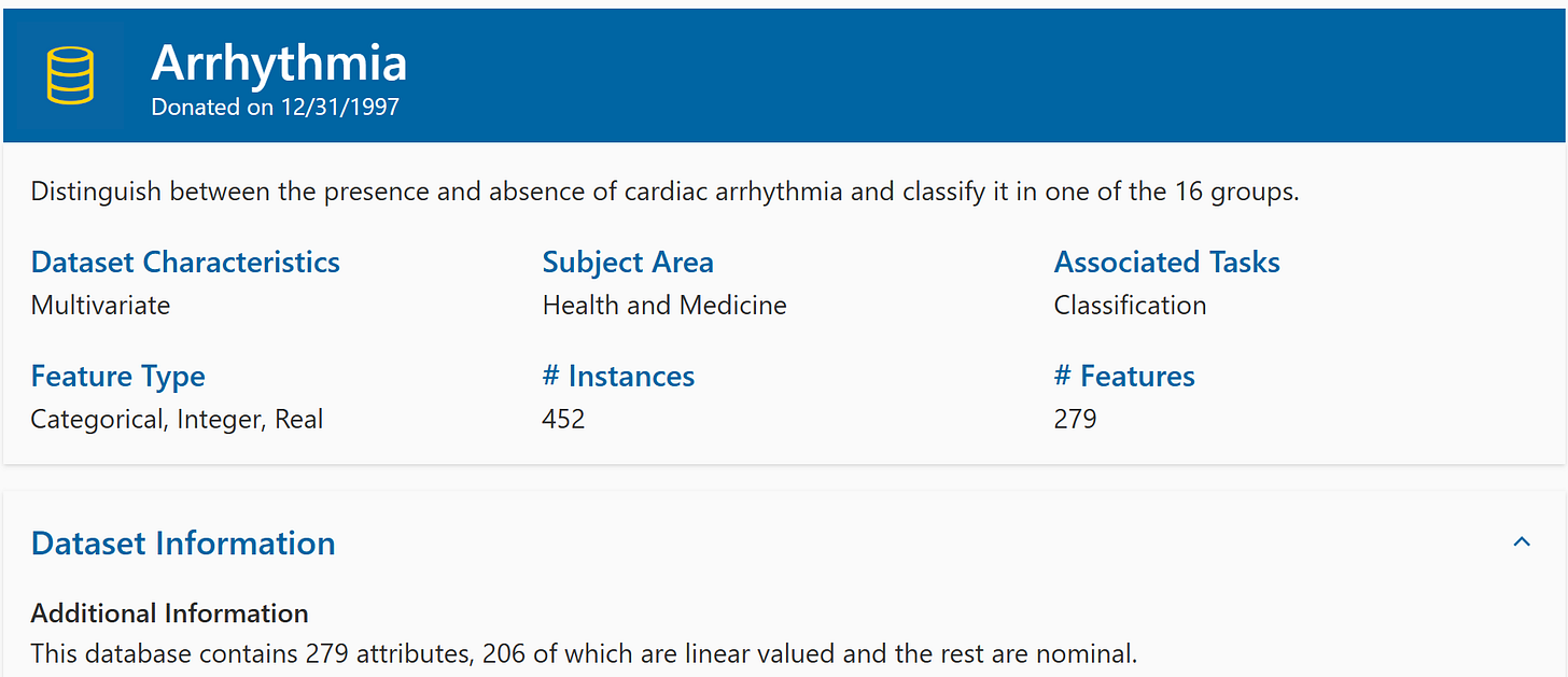
Before getting to the analyses, I will briefly introduce the dataset. It is called the “arrhythmia” dataset and is used to build machine-learning models that predict cardiac arrhythmia (an irregular pattern of heart beats that can indicate heart disease).
The data are stored on the University of California, Irvine (UCI) machine-learning repository. If you’re interested in machine learning, you should definitely become familiar with the UCI ML repo. It is a fantastic resource for free datasets that many people use to study and develop machine-learning models.

The dataset contains 279 features (variables), but for simplicity, I’ll just focus on the first five. The data are easily imported using pandas:
Figure 2 shows summary statistics of the dataset.
Demo 1: CIs before and after data cleaning
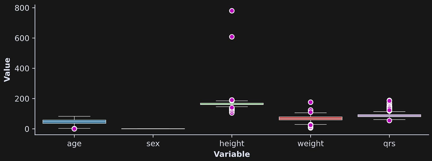
Several variables contain extreme values, which you can see in the box plots in Figure 3.

sex variable is dummy-coded to 0 and 1, so there are no outliers and the variability is small.Outliers are tricky in data science. On the one hand, many outliers reflect valid data and tell an interesting story (e.g., Jeff Bezos is a wealth outlier). On the other hand, outliers can introduce biases into statistical analyses that prevent a valid interpretation.
Nonetheless, identifying and dealing with outliers is a topic for a longer discussion; the goal of Demo 1 is to calculate CIs on sample averages with and without extreme data values.
To identify and remove outliers, I created a copy of the dataframe and transformed each variable (except sex) into z-scores. A z-score is a standardized measure that has a mean of zero and a standard deviation of one. It’s a useful way to compare variables of different scales. Here I will use it for visualization and outlier removal.
The outlier removal is achieved in the code below. See if you can understand what it does before reading my explanations below.
It is occasionally acceptable to modify data in the original dataframe, but it’s usually better to create copies so that you can still access the raw data when you need. You can equivalently create new columns in the original dataframe with new column labels. The important thing is to preserve the original data.
Here I apply the z-score transform to all the columns. The z-score transform involves subtracting the mean and dividing by the standard deviation. I don’t z-score the
sexcolumn because it’s not a random variable; it can take only one of two values (0 or 1), and has no outliers.Here I replace extreme values with NaN (not-a-number). I labeled data points as outliers if they have a z-score greater than 3.29. That score corresponds to a probability value of .1%. In other words, given normally distributed data, you would expect only .1% of values to have a z-score more extreme than 3.29. That’s very unlikely, and so those values are labeled as outliers and removed from subsequent analyses.
Notice that I copied the dataframe again. Thus, I didn’t replace the original data values, but instead, replaced the data in a copy.
Final note here: You don’t need to create a separate dataframe just for the z-scored data; I did that here in case you want to visualize those data to compare against the original data.
Figure 4 shows the box plots with and without cleaning. There are still some data values that are a bit extreme, but certainly not as bad as before cleaning (notice the difference in y-axis limits).

So, now we have two dataframes, one before and one after cleaning. We are now ready for CI investigations.
I used the following code to extract CIs around the average of each column; I hope that code looks familiar from Part 1 of this post series ;)
That code is repeated for the cleaned data, and then put inside a for-loop over all columns. The text below shows the mean and CIs for each of the variables.
   age initial:  46.47 +/- 1.52
   age cleaned:  46.47 +/- 1.52

   sex initial:   0.55 +/- 0.05
   sex cleaned:   0.55 +/- 0.05

height initial: 166.19 +/- 3.44
height cleaned: 163.84 +/- 0.96

weight initial:  68.17 +/- 1.53
weight cleaned:  68.33 +/- 1.36

   qrs initial:  88.92 +/- 1.42
   qrs cleaned:  87.48 +/- 1.07
Two comments here: (1) The age and sex variables have identical CIs before and after cleaning. Those variables had no outliers, so nothing changed. (2) For the other variables, the CIs are smaller after cleaning. No shocker there, either: Remember from the first post that the CI formula has the sample standard deviation in the numerator, and so removing large data values shrinks the standard deviation, which in turn shrinks the CI.
Figure 5 shows a visualization of the change in CIs. The CI width is on the y-axis, and the CIs either stay the same or decrease after cleaning.
Demo 2: CI of a correlation coefficient
The goal of this demo is to use bootstrapping to determine the statistical significance of a correlation coefficient. If we would assume normality in the data, then there actually is an analytic formula for a correlation coefficient CI, but we’ll use an empirical approach here.
I’ll focus on the relationship between weight (in kg) and QRS duration (in milliseconds). QRS is a measure of heart functioning that is seen in an electrocardiogram (ECG). It’s the typical heart-rate-looking bump signal that you’ve seen in cartoons and movies (Figure 6).
There is a lot of complex physiology that goes into the QRS complex, but for purposes on this dataset, the important thing to know is that longer QRS complexes indicate a risk factor for cardiovascular disease.
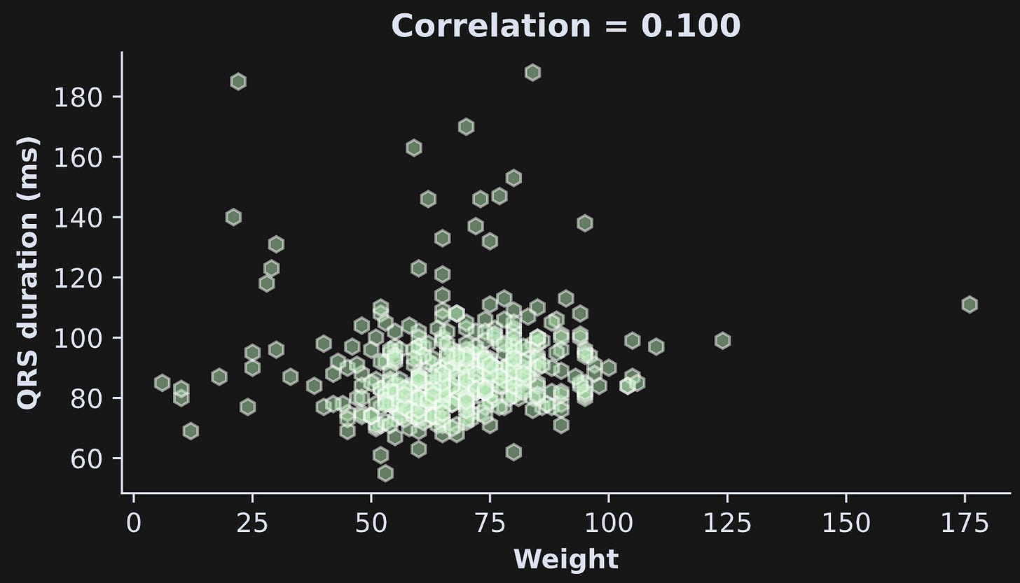
The question at hand here is whether QRS duration increases with weight. Figure 7 shows the scatter plot and correlation coefficient (note: I’m using the original data here, not the dataset I cleaned in Demo 1). The correlation is numerically positive but not very strong. We will use bootstrapping to determine whether that correlation coefficient is statistically significantly greater than zero.

By the way, there are some very low values of weight. That’s because there are children included in this dataset; you can see this in Figure 2 (summary of the dataset) and by adapting the code to plot weight by age instead of weight by QRS.
Now for the CI calculation. The mechanics are identical to what I explained in post 2, except here we use the correlation coefficient instead of the average or standard deviation.
Lucky for us, pandas dataframes have a method called sample() that selects a random sample. So we simply need to take a random sample with replacement, correlate weight and QRS duration, and store the result in a vector. Repeat that 1000 times, and then we find the 2.5% and 97.5% of the distribution of resampled correlation coefficients. If r=0 (the null-hypothesis value corresponding to no relationship between weight and QRS) is outside from the CI bounds, then we can conclude that the correlation coefficient is statistically significant.
Figure 8 shows the distribution of the resampled correlation values (r), the CI region, and the null-hypothesis value of r=0. What can we conclude from this analysis?
The CI includes the null-hypothesis value. Therefore, the correlation between weight and QRS duration is numerically positive but it’s not statistically significantly different from zero.
These plots and the conclusions are based on the original data, without cleaning. If you are following along with the code (which I super-duper really a lot recommend!), then I encourage you to re-run Demo 2 using the cleaned dataframe that we created in Demo 1. The correlation coefficient becomes significant, and it’s interesting to compare how the bootstrap distribution changes after removing a few outliers.
Congrats on finishing this post series 🤗
I write these posts because I want to bring high-quality technical education to as many people as possible — but also because it’s my job and my source of income. Please consider supporting me by enrolling in my online courses, buying my books, or becoming a paid subscriber here on Substack. If you have a tight budget, then please keep your money for more important things, and instead just share these links.


