
DDC-20: Exploding pie chart
A data challenge a day helps you master machine learning

About these daily data challenges
Each post is an exercise that helps you learn about data in Python.
Try to solve the exercise before checking my solution at the bottom of the post 🤓
You can share your solution or visualization in the comments!
Today’s challenge
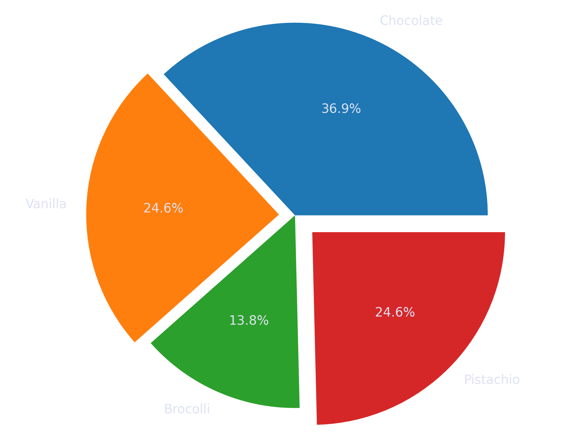
The following data come from a survey of people’s favorite ice cream flavors (j/k, these are fake data that I made up).
 Chocolate : 24
   Vanilla : 16
  Broccoli : 9
 Pistachio : 16
Visualize these data in a pie chart as below.
.
.
.
.
Scroll down for the solution…
.
.
.
.

.
.
.
.
keep scrolling!
.
.
.
.
import matplotlib.pyplot as plt

# data and labels, specified in a dictionary
d = {
    'Chocolate': 24,
     'Vanilla' : 16,
    'Broccoli' : 9,
   'Pistachio' : 16,
   }


# note that plt.pie() automatically computes proportion
plt.pie(d.values(), labels=d.keys(),
        explode=[0,.1,0,.15],autopct='%.1f%%',radius=1.2 )

plt.show()