Drawing text heatmaps to visualize LLM calculations
Coloring words can help you understand how language models like GPT work.
What is a “text heatmap”?
Good question ;)
A “heatmap” is a way of visualizing data that maps numbers onto colors. You see heatmaps when looking at weather predictions, for example where colors are superimposed on top of a map to indicate the probability of rain in different areas.
In natural language processing (NLP), a text heatmap is a way of visualizing some analysis result on top of text. Here’s an example:
Each word and punctuation mark sits inside a colored box, and the color of that box corresponds to some analysis result. In this case, that result is the ability of the GPT2 language model (a precursor of ChatGPT-5) to predict each word, based on the previous words.
The purpose of this post is to show you how to create that heatmap from scratch in Python.
Creating a text heatmap in Python
In this section of the post, I will show you how to create a text heatmap using the matplotlib library. The LLM calculations will come in the next section; for now, just focus on creating the visualization.
Note: As always in my posts, the code boxes here show only snippets that convey the essence of the code. You can get the full code file (for free!) from my github page.
The idea of generating a heatmap is to display text on an axis using plt.text(), and then color the bounding box behind each piece of text according to some data value. In this first demo, that “data value” will simply be the word length, just to keep things simple. Then we’ll do some LLM investigations in the next section.
We need to know how wide each word is — that is, how much it spans the x-axis. The code below draws a letter in an axis, finds its bounding box, and then converts the bounding box into units of axis coordinates.
fig,ax = plt.subplots(figsize=(10,2))

# draw a text object
temp_text = ax.text(0,0,'n',fontsize=12,fontfamily='monospace')

# get its bounding box in display coordinates
bbox = temp_text.get_window_extent(renderer=fig.canvas.get_renderer())

# convert from display to axis coordinates
inv = ax.transAxes.inverted()
bbox_axes = inv.transform([[bbox.x0,bbox.y0], [bbox.x1,bbox.y1]])
en_width = bbox_axes[1,0] - bbox_axes[0,0] # bbox is [(x0,y0),(x1,y1)]
Why did I pick the letter “n”? Do I need to repeat this code for each letter, number, symbol, punctuation mark, and so on?
Technically, yeah, we could do that. But if we generate the text box using a fixed-width (monospace) font, then all characters have the same width. That’s handy, because it means that a 5-letter word spans 5*en_width units on the x-axis.
Armed with that knowledge, we can now create a text heatmap! To start simple, I will create a heatmap in which the color of each word is mapped onto the length of that word.
Are you familiar with the Lorem Ipsum text?
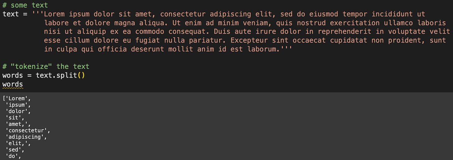
Lorem Ipsum is fake text that printers in yonder times used to test layouts of books and newspapers. The figure above also shows a “tokenization,” aka splitting the text into words according to spaces. The heatmap will look like this:
How do we create that? Keep reading :D
Because the color corresponds to word length, we obviously need to calculate the length of each word — which is the same as the number of letters per word for a monospaced font:
import numpy as np
lens = [len(i) for i in words]
lens = np.array(lens)
It’s not strictly necessary for the variable lens (word lengths) to be a numpy array instead of a list, but that does make the next calculation a bit easier.
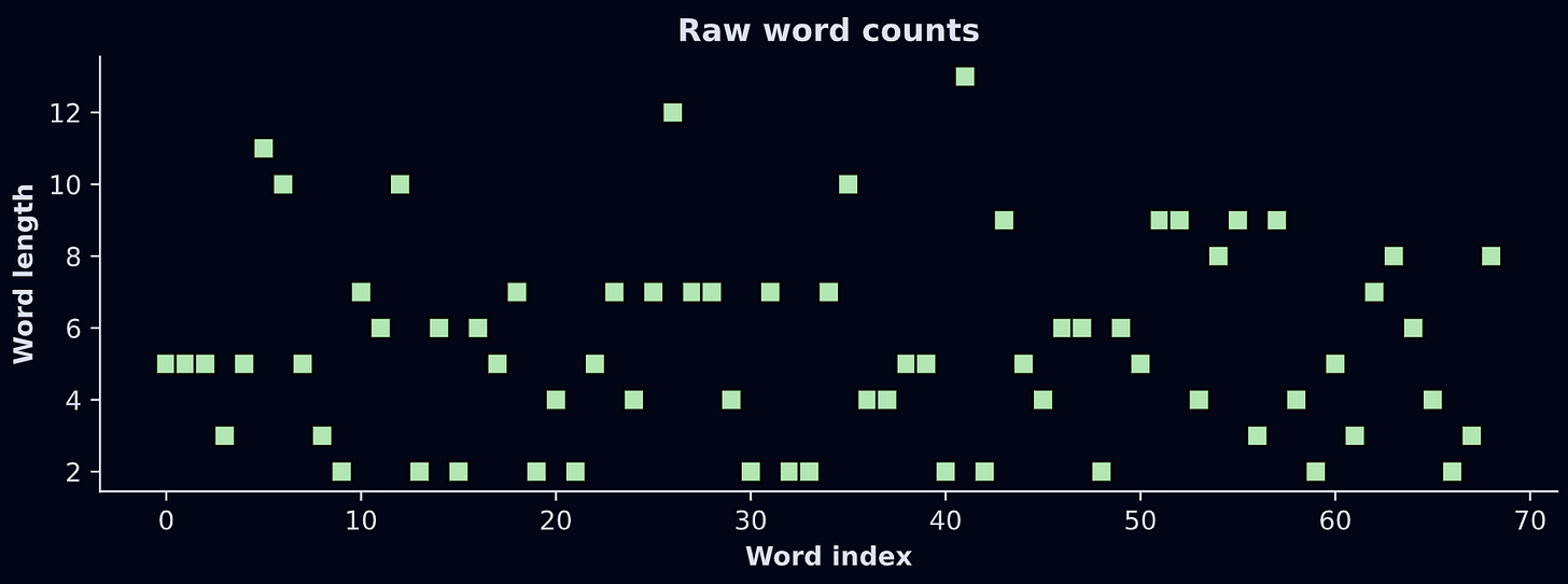
The numbers in the variable lens are integers between 2 and 13:
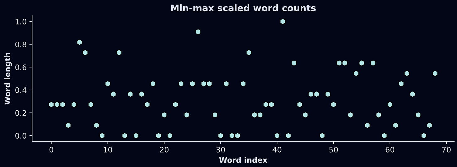
Those numbers will get mapped onto the color of each word-box. But there’s a problem: Matplotlib colormaps are indexed using scalar values between 0 and 1.
The solution is to scale the data. Min-max is the perfect transformation for this application: It transforms any numerical dataset into a range of [0,1]. Here’s the formula:
The way to think about that formula is that the numerator shifts x down such that the smallest value becomes 0, and the denominator divides by the total range of the data, which means the largest possible value becomes 1. Check it out:
Now for the code that creates the heatmap. There’s quite a lot of code here for one code-block, so I’ve put numbers into comments that the text below the code block explains. But before reading my explanations, I want you to see how much of the code you can understand simply by looking at it.
# 1) initializations
x_pos = 0  # starting x position (in axis coordinates)
y_pos = 1  # vertical center

fig, ax = plt.subplots(figsize=(10,2))
ax.axis('off')

# 2) for-loop
for i,word in enumerate(words):

  # 3) width of this word
  word_width = en_width*len(word)

  # 4) colorval is the scaled length of the word
  colorval = charcountsScale[i]

  # 5) text object with background color matching the scalar value
  ax.text(x_pos+word_width/2, y_pos, word, fontsize=12,
          ha='center', va='center',fontfamily='monospace',
          bbox = dict(boxstyle='round,pad=.3',
          facecolor=mpl.cm.Reds(colorval), edgecolor='none', alpha=.8))

  # 6) update x_pos
  x_pos += word_width + .015 # plus a small gap

  # 7) end of the line; reset coordinates and counter
  if x_pos>1.2:
    y_pos -= .2
    x_pos = 0

plt.show()
These are variables that keep track of the x- and y-axis positions of each word. Those are used for plotting and to determine when to skip to the following line of text.
Loop over all the words to print.
Calculate the width of each word.
Get the scalar value to map this word onto a color value. In actual LLM analyses, this value will correspond to some activation or prediction value from the model.
Here’s where I draw the text. There’s a lot going on in this line, but if you scan through the inputs to
ax.text(), you’ll see that I’m just drawing this word with a monospace font and position parameters. The key part here is thefacecolor=argument; that picks out the shade of red that corresponds to the length of the word.After each word is drawn, x_pos increases by the word width and a small adjustment to create a space between words. “.015” is just some arbitrary number I chose after trying different values.
After some trial-and-error, I found that x=1.2 is a pretty good width of a line of text given the other parameters, so when the current x-axis position exceeds that, the y-axis value drops and the x-axis value resets to zero. That’s like when an old-school typewriter pushes the page up by one line and swings that big paper-roller-holder-thingie to the left. (I lack the lingo of typewriters, but if you Google it, you’ll see what I mean.)
And here’s what it looks like:
Notice that the longer words have a darker red background while the shortest words have a nearly transparent background. Pretty cool 😎
And that’s how to create a text heatmap! The next step is to use colors that correspond to something meaningful, like the calculations of a GPT language model.
Analysis with GPT2
Understanding how LLMs like GPT work is no small feat. Sure, you can watch a 10-minute YouTube video about it — and that’s great, I’m a fan of light edutainment — but to really understand the mechanisms of LLMs you need to do more than read the following paragraph (insert shameless plug for my LLM mechanisms course).
The idea of an LLM like ChatGPT is to represent text as a sequence of vectors, and calculate tiny adjustments to those vectors such that the vector points to word t at the start of processing, and to a predicted word t+1 at the end of processing. For example, let’s consider the text “the cat sat on the “. A language model like GPT will transform each of the words (technically, tokens not words, but I’ll ignore that nuance here) into vectors, and pass those vectors through a series of “transformer” blocks that rotate and stretch each vector by a small amount. Those adjustments are based on context from the previous words, and on world knowledge that the model acquired during training. As the vectors pass through each of dozens of transformer blocks, the vectors transition from representing the current word to a prediction about the next word. The final vector for this text starts off pointing to the word “the”, but by the end of the model calculations, it points to words like “floor” or “mat”, as opposed to words like “of” or “17.3” or the tens of thousands of other words that just don’t make sense given the context.
What we’re going to do in this code demo is check the LLM’s prediction about each subsequent word. The easier it is to predict each word based on previous words, the higher the prediction. And that prediction will be colored in a text heatmap. It’s a neat demo because it provides some insight into how the model can predict some words better than others.
Importing GPT2
Let’s start by importing OpenAI’s GPT2 model. It’s a simple model, not even close to the capabilities of commercial models like GPT5 or Claude. But GPT2 is free, light-weight, and small, so it’s a popular choice for people learning how to decompose transformer-based LLMs.
import torch
import torch.nn.functional as F
from transformers import AutoModelForCausalLM, GPT2Tokenizer

# GPT2 model and its tokenizer
gpt2 = AutoModelForCausalLM.from_pretrained('gpt2')
tokenizer = GPT2Tokenizer.from_pretrained('gpt2')
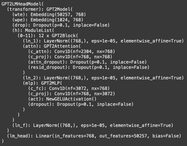
The figure below shows the model architecture overview. If you’re new to Pytorch and LLMs, then this might look overwhelming and uninterpretable; in which case, don’t worry about it. It’s just a high-level overview of the different layers of the model and their sizes.
Calculating next-token predictions (logits)
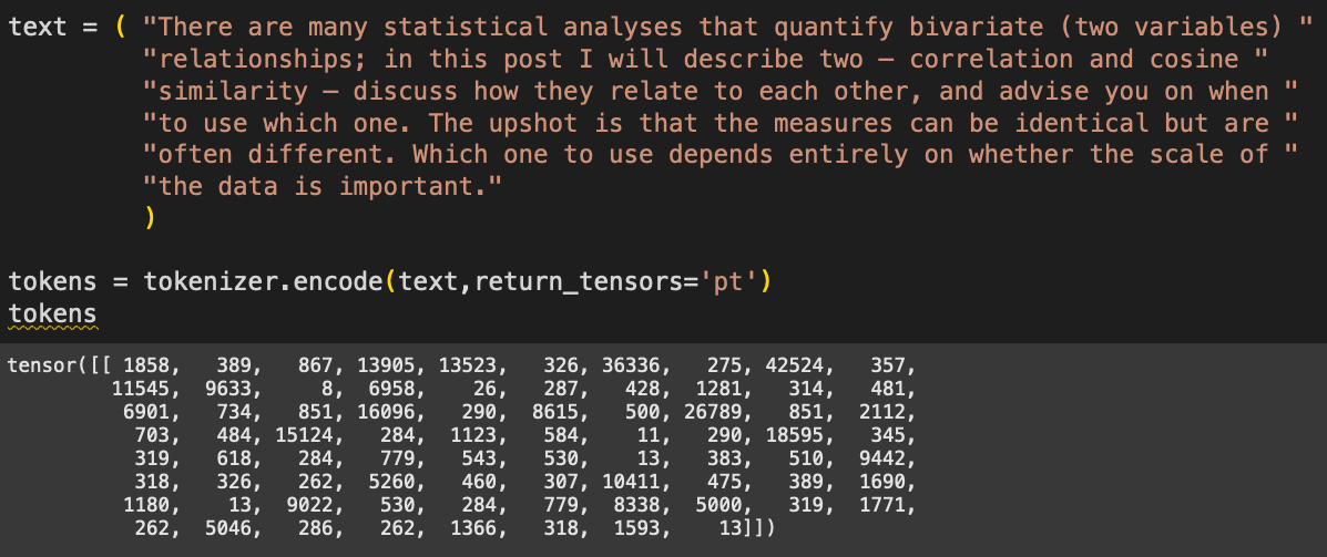
Now we need some text for the model to process. I’ve copied some text from another post about correlation vs. cosine similarity (yep, that’s another shameless plug to more of my work).
The numbers correspond to tokens — integers that represent words and subwords. We tokenize text because language models don’t actually process text; they process numbers that correspond to pieces of text.
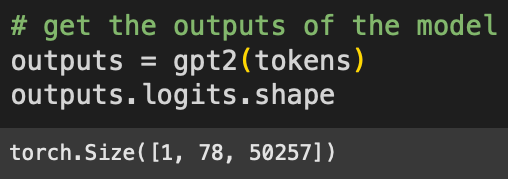
Now to push those tokens through the model. This “forward pass” is what happens when you put text into the ChatGPT text field and press Enter.
The “logits” are the model’s final outputs, and are used to make predictions about which token comes next. The sizes correspond to: 1 sentence in the batch (models are capable of processing multiple text sequences simultaneously), 78 tokens in the text, and 50,257 tokens in GPT2’s vocabulary. That is, GPT2 has a lexicon of just over 50k chunked character sequences that form subwords and words.
When a language model like ChatGPT generates new text, it looks through all 50k logit values from the final token (in python code, that would be logits[0,-1,:]) and picks the token with the largest logit. In practice, the model picks tokens probabilistically, for example randomly picking from the top 3 largest logits; that’s the main reason why LLMs give different answers each time you give the same prompt.
But the important thing is this: That logit value is the model’s best guess at what the next word should be. And because we know what the next token actually is, we can measure how well the model’s prediction matched the actual text.
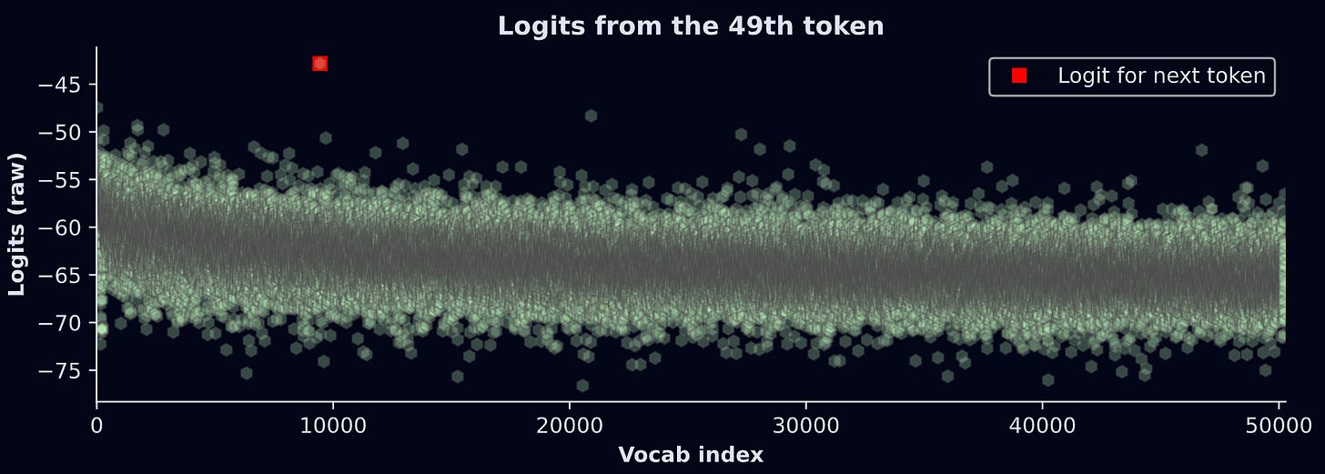
For example: The 50th token in the text is “shot“. As the model processed the 49th token (“ up”), it made a prediction about what the next token should be. So we can check whether the largest logit from the 49th token corresponded to the vocab item “shot“. The figure below shows the results.
What does this graph show? The model makes a prediction (y-axis) for each of the 50,257 text segments in its lexicon (x-axis). The highest logit is for vocab index 9442, which corresponds to the token “shot”. In other words, given the current token (“ up”) and all the previous tokens, the model thinks that the next token should be “shot”. That’s an accurate prediction! Not bad for GPT2 :)
btw, the units on the y-axis are the raw outputs of the LLM. They are not interpretable on their own; instead, they should be transformed into probability values. I’ll get back to this in a moment.
The goal of the rest of this demo is to repeat this procedure for all the tokens in the text, and then color that prediction on a text heatmap.
Text heatmap of predictions
The code below is a for-loop that gets the data we’ll map onto colors. I’d like you to see how much of it you can understand before reading my explanations below.
# 1) initialize vector of log-probabilities for each token
predicted_logSM = np.zeros(len(tokens[0]))

# 2) loop over tokens (skip first)
for toki in range(1,len(tokens[0])):

  # 3) get the logit outputs and convert to log-softmax
  # previous token position predicts current token choice
  tokenlogit = outputs.logits[0,toki-1,:]
  lsm = F.log_softmax(tokenlogit,dim=-1)

  # 4) extract the softmax for the actual token
  predicted_logSM[toki] = lsm[tokens[0,toki]].item()
Initialization. We will store the probability that the model predicted the correct subsequent token.
Loop over all the tokens in the text. But notice we start counting at index 1 (Python is a zero-based indexing language, so index #1 is actually the second position). The first token in a sequence doesn’t have a prediction. If we were using this model to generate new text (e.g., a chatbot), then we could extend the loop beyond the text length.
This is the main calculation. We extract the logits from the previous token, then convert to log-softmax. What is log-softmax and why do we need that transformation? Softmax is a way to transform a set of numbers into probabilities. Those probabilities provide a better measure of what token the model “thinks” should come next. Taking the logarithm of probabilities is common practice in machine-learning, and improves numerical stability. I’ll have a separate post just about softmax and its nuances, but the upshot here is this: log-softmax is easier to interpret than logits.
The variable
lsmis a vector of 50,257 elements. It’s the log-probability of each token in the vocabulary. In other words, it’s a list of what tokens the model “thinks” should come next. The right-hand-side of the equation extracts the log-prob for the current token.
Notice the logic in this for-loop: We get the predictions from the previous token about the current token.
We’re almost ready to make the heatmap! One final transformation: Remember that the colormaps are indexed using values between 0 and 1, but log-prob values are negative. So we need to min-max scale the log-prob predictions. In this case, the scaling code is slightly different than what I showed earlier, because we want to exclude the first token: the model cannot make predictions about the first token, so it has no interpretable probability value. We want it to be zero (the initialized value).
y = predicted_logSM[1:] # ignore the first value
predicted_logSM[1:] = (y-y.min()) / (y.max()-y.min())
The final step is to repeat the code to produce the heatmap. I’m not pasting the code here because it’s mostly redundant with code I showed earlier, but of course you can find it in the online code file.
And voila!
Again, the color intensity corresponds to GPT2’s ability to predict each token. For example, after seeing “The upshot is “, the model was really confident that the next word should be “that”. On the other hand, after seeing “cosine similarity — ”, the model was really shit at predicting “discuss”. I wonder if that means I made a poor word choice or a good word choice…
I hope you enjoyed learning how to create and interpret a text heatmap. Visualizations like this are very insightful and powerful ways to understand language model mechanisms.
Try this at home! Please make a copy of my notebook file for this post and play around with it: Try different texts, different colormaps, different data transformations, etc. If you find something mysterious, please share it :)
And if you really want to learn more about how LLMs are put together and how to do deep research on them, consider taking my full-length course.
You rock
If you are reading this, then you have earned my respect.
If you would like more people to be able to read content like this in the future, then please support me. How can you do that? Enroll in my courses (they’re around $20 each!) and/or buy my books — or at least tell your friends and Batman about me. Especially Batman.


