
Two-variable dependence part 2: Mutual Information
Learn the theory and code of the most important and foundational statistical measure of nonlinear relationships.

About this three-part series
I wrote this post series to explain how covariance and mutual information are related to each other, and when to use which one. Both quantities measure the relationship between two variables. But they really are different, and have different assumptions, provide different insights, and are used in different applications.
In Part 1 you learned about covariance, which is the most commonly used measure of linear dependencies.
Now in Part 2 you will learn about mutual information, which is the most commonly used measure of nonlinear dependencies.
In Part 3 you’ll see a direct comparison between covariance and mutual information in simulated and real data.
Follow along using the online code
As a reminder from the previous post: only the essential code snippets are shown in this post; the full code file to reproduce, extend, and adapt the analyses are in the code file on my GitHub. It’s one Python notebook file for the entire post series, so you need to scroll down about 1/3 of the way to find the code for this post.
Detailed video walk-throughs
As in the previous post, there are detailed video walk-throughs of the demo code, in which I provide deeper insights into mutual information. The videos are at the bottom of this post, and are available to paid subscribers.
What are nonlinear statistical relationships?
Consider the figure below; it’s nearly identical to a figure you saw in the previous post, except that here I’ve also calculated mutual information between the the x- and y-axes. What do you notice about mutual information vs. covariance?
Here are some observations:
Mutual information is always positive, even when the covariance is negative.
Mutual information is zero when the covariance is also (nearly) zero in the upper-middle plot. In this case, there is neither a linear nor a nonlinear relationship between the variables.
Mutual information is non-zero in all three plots in the bottom row. The variables are clearly related to each other, in the sense that knowing the value of one variable tells you about the value of the other variable. Covariance was unable to detect those relationships.
Here is the key difference between covariance and mutual information:
Covariance asks: How strong is the linear relationship between these two variables?
Mutual information asks: How much do I know about one variable if I know about a second variable?
Notice that the mutual information question doesn’t specify that the relationship needs to be linear, positive, or negative; it simply asks what information does one variable provide about another variable.
Now that you’ve seen some examples, let’s take a step back and figure out how to calculate mutual information.
Entropy in categorical variables
Mutual information is based on a quantity called entropy. Entropy is a measure of variability. It is conceptually similar to variance — indeed, variance is to covariance as entropy is to mutual information.
But whereas variance is the average dispersion around the mean, entropy is a measure of how probable different values are. For example, if you have a bag of purple M&Ms, you won’t be surprised when you reach in and pull out a purple M&M. All the M&Ms are purple, so there’re no surprises, perfect predictability, and entropy is zero.
On the other hand, if you have a bag of colored M&Ms, then reaching in and pulling out a purple M&M is a bit surprising. The M&Ms can be one of a few different colors, so you’re not guaranteed to get a purple one. In the parlance of information theory (the mathematical framework in which entropy and mutual information are forged), “surprise” means any event that cannot be perfectly predicted, like the color of a randomly picked M&M. Entropy is the quantification of the total surprise in the entire system — the whole bag of M&Ms.
In the equation below, x refers to the set of possible events (e.g., different M&M colors), x_i is one particular event (e.g., picking a purple M&M), N is the total number of possible events (e.g., N=6 if there are six M&M colors; it’s not the number of M&Ms in the bag), and p is the probability of each event being observed.

(What does the H stand for? Apparently it has remained mysterious for over a century, although it is related to Boltzman’s work.)
Consider what happens in that equation when all M&Ms are purple: N=1, p(x_i)=1, but the log of 1 is zero. Thus, zero entropy when the system is totally predictable. As the system becomes more unpredictable, for example with larger N and p<1, the entropy increases.
Actually, the terms inside the summation decrease, because the log of a number less than 1 is negative, but I guess Claude Shannon thought that positive entropy is more intuitive than negative entropy, so he stuck a minus sign in front. That minus sign is not mathematically required; it is used to facilitate interpretation, and that becomes relevant for interpreting mutual information.
Demo 1: Entropy in categorical variables
Figure 2 below shows an example of entropy in a system with N=9 and larger numbers having lower probability. The colors are mapped onto the proportions of observations of each “category,” or integer.
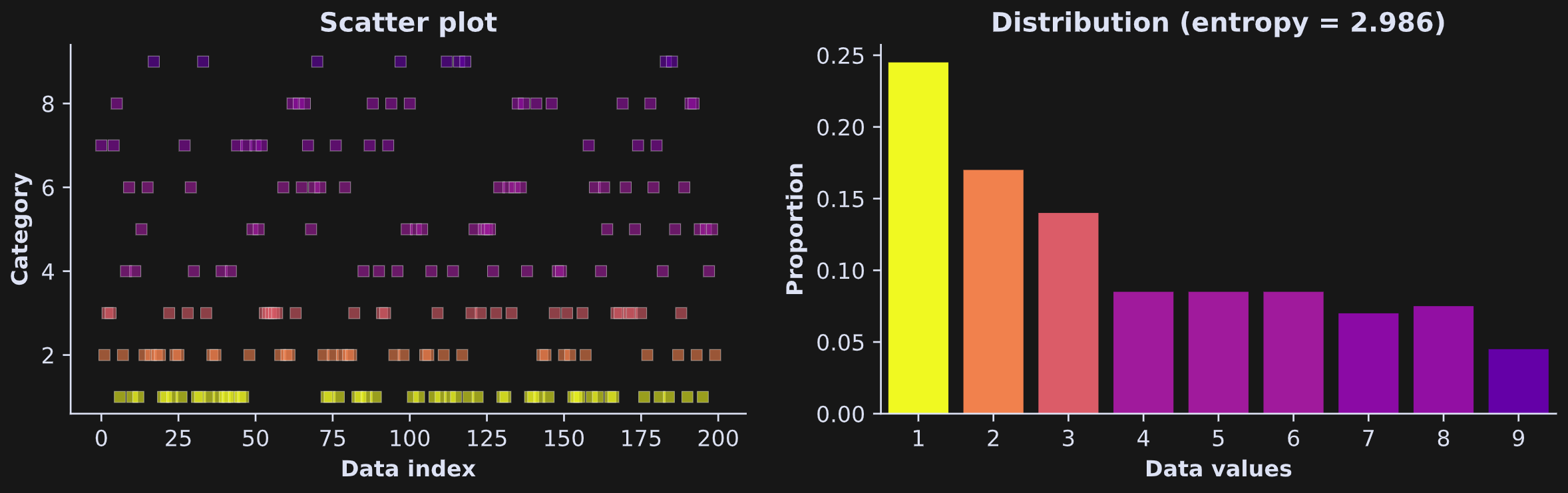
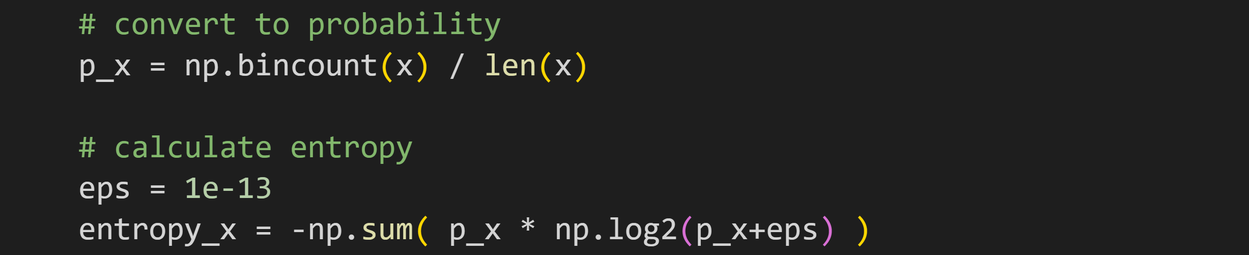
I created that dataset by squaring uniformly distributed numbers, and then taking their ceiling (rounding up to the nearest whole number). Here’s the code to calculate entropy (and here’s a link to the full code file):
The numpy function bincount is similar to np.histogram, except that bincount is for categorical variables, whereas creating a histogram requires specifying bin boundaries for continuous variables. The output of bincount is the number of observations of each unique element — that is, the number of times a “0” appears in x, the number of times a “1” appears, etc.
Dividing by the number of elements in the dataset transforms the output from counts to proportions. Proportions are technically not the same as probabilities, but in lieu of known probabilities, the empirical (observed) proportions are a good estimate.
But what’s the deal with the eps variable, and why do I add it to the logarithm function? That is definitely not part of the equation I showed earlier.
eps stands for the Greek letter epsilon (ε), and is used to represent a tiny number. It’s added to the logarithm because the log of zero is undefined, which causes numerical problems. So in the code, if p_x is 0, then np.log2(eps) is -43, but then it multiplies p_x and thus contributes nothing to the entropy value without worrying about numerical issues.
Don’t forget to check out the demo-1 video at the bottom of this post!
Entropy in continuous variables
Entropy in categorical variables is straightforward, because there is a finite (and typically small) number of possible values the variable can take. For example, there are only six traditional M&M colors. Even for the specialty M&Ms, the number only gets up to around 20.
But what about continuous variables, for example height? Height is not a categorical variable; If someone tells you that they are 175 cm tall, they’re not exactly 175.000…. And your height changes subtly during the day (you’re around 1 cm taller in the morning). If you follow the entropy equation, you’d have N=∞ possible categories (e.g., 175.00001, 175.00002), which is tedious to calculate by hand. But even more troubling, the exact probability of any one continuous number is zero. So the entire equation just doesn’t work.
Fortunately, the solution is simple: Discretize the continuous variable by binning the data. You’re no longer interested in the probability of someone being exactly 175.234293842 cm tall; instead, you calculate the probability of someone being between 170 and 175 cm.
Binning, of course, can be achieved by creating a histogram of the data. That’s great because it means we don’t need to use a different formula for continuous variables; we just need to bin the data to form categories.
Demo 2: Entropy in continuous variables
Let’s calculate entropy in the dataset shown in Figure 3.
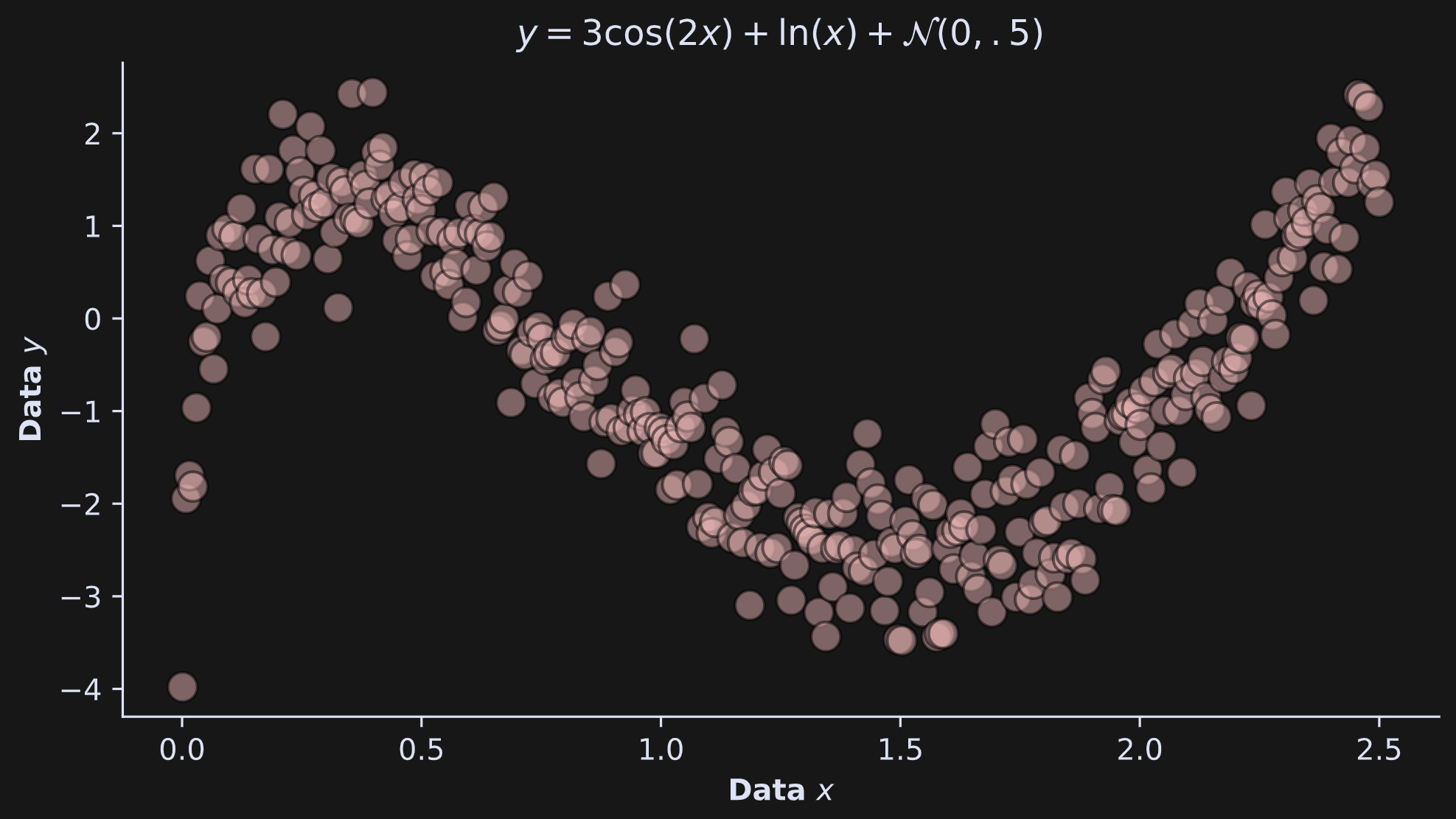
Here’s how I calculated those data:

In my naive optimism, I tried to calculate entropy in the same way as with the categorical data. But my optimism proved too naive:
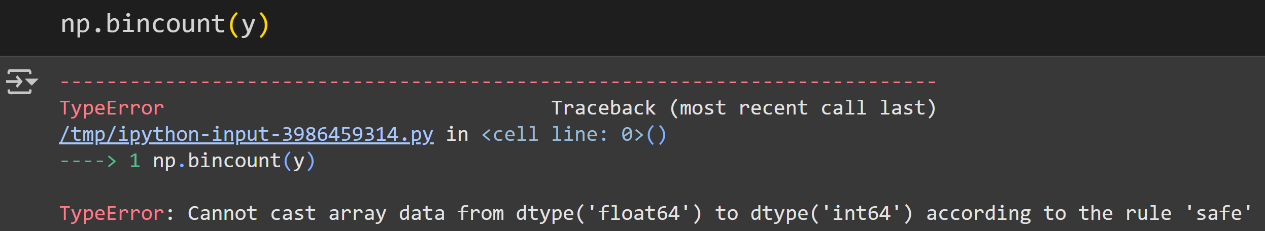
The error message is a bit cryptic if you’re not steeped in Python variable types, but it basically says that the bincount function only works on integers (whole numbers) whereas I tried to use it on floats (numbers with a decimal point).
But fear not, gentle reader! ‘Tis but a trifle to fix.
All we need to do is replace the bincount function with the histogram function, in order to discretize the data. Specifying the option density=True is convenient because it returns proportions instead of counts — same as dividing the counts by the number of data points as we did with np.bincount.
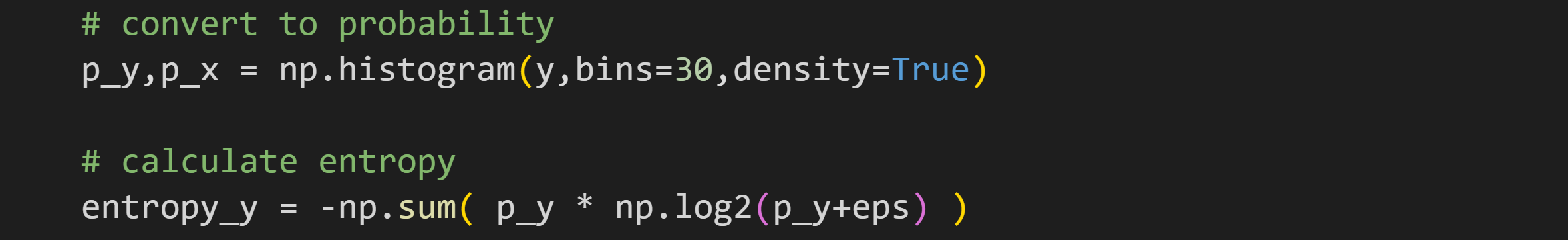
Figure 4 shows how the data look, discretized and colored. Please take your time staring at that figure, partly because it just looks really cool, and partly to understand how the colors in the scatter plot relate to the bar locations and heights in the histogram.
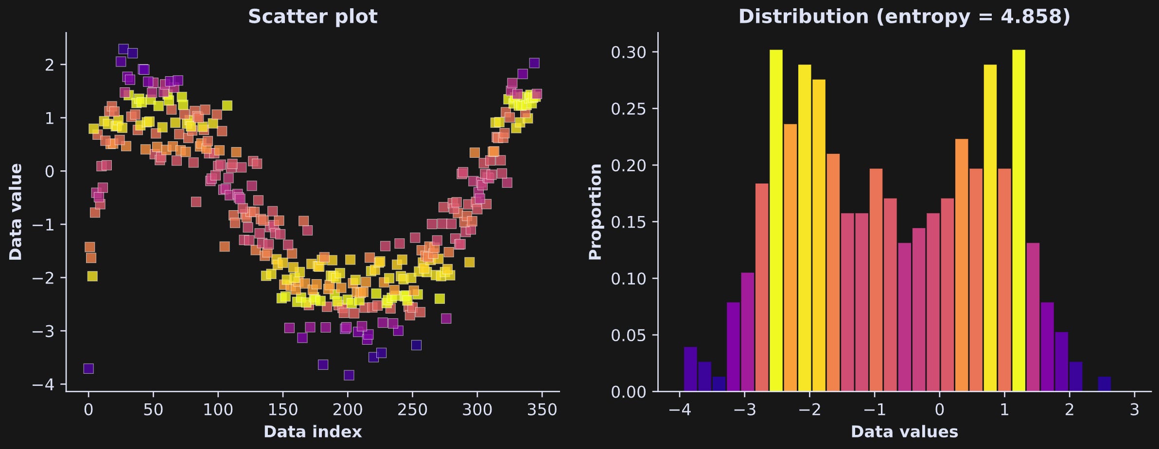
Why did I use 30 bins, and does that impact the entropy value?
The answers are “no reason” and “yes.” I picked 30 arbitrarily; I could have used 28 or 17 or 54 bins. There are guidelines in statistics for how to choose the number of bins in a histogram (e.g., Friedman-Diaconis, Scott’s, Sturges), but those guidelines are not absolute rules, nor do they give the same answer. Thus, binning is the right thing to do, but the number of bins is a parameter that has some arbitrariness.
The figure below is from an investigation into the entropy (y-axis) as a function of the number of bins (x-axis).
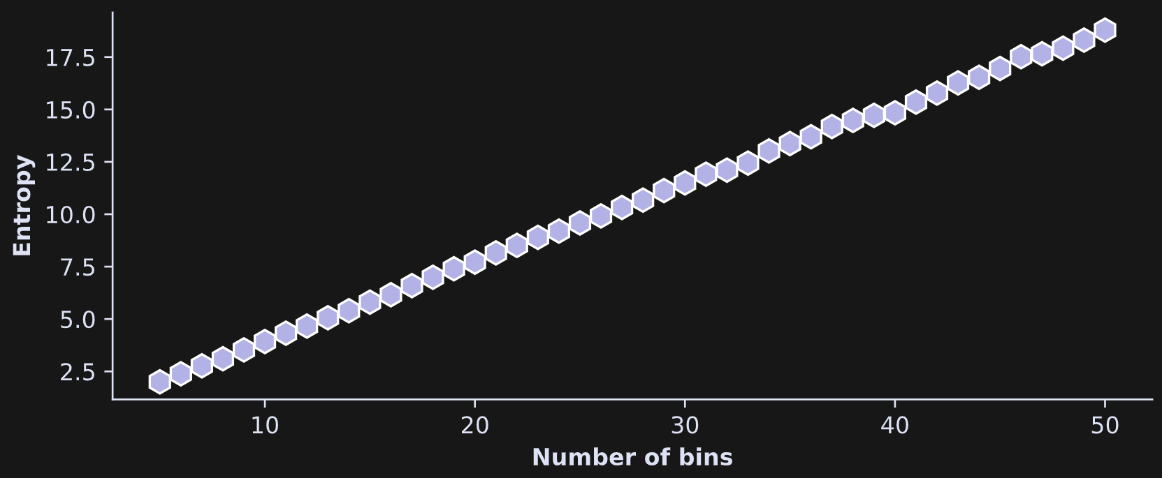
The conclusion here is that bin count is an important parameter in the analysis! Fortunately, the bin count has little impact on relative entropy. That is, if you compare entropy between different variables, experiment conditions, or time windows, then as long as the number of bins is the same for all analyses, the relative entropy between analyses is interpretable.
If you’re a paid subscriber, this is the place to switch from reading to watching the video (scroll down to the bottom) for demo 2!
Joint entropy and mutual information
So far in this post, I’ve discussed entropy for one variable. But the post series is about bivariate relationships and mutual information. To calculate mutual information, we need three quantities: the entropy of x, the entropy of y, and the joint entropy of x and y.
The single-variable entropies you know how to calculate from the previous section.
Joint entropy is the same concept as single-variable entropy, and also the same procedure: Discretize the data and make a histogram, and then calculate the sum of P×log2(P).
The only difference is the dimensionality. A two-variable dataset gets discretized into a 2D grid. This is illustrated in Figure 6 below. The left plot shows the data as a scatter plot (same as above). The right plot shows a 2D grid in which the color of each rectangle corresponds to the number of data points in that bin (the continuous data are drawn on top on for visual clarity).
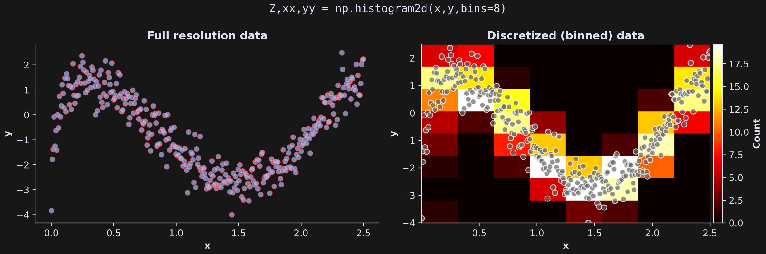
Here’s how it looks in Python:
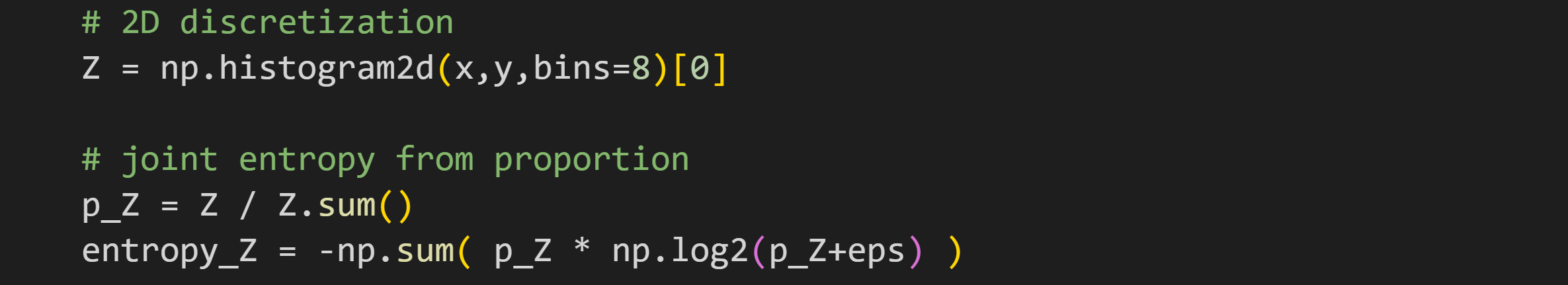
And that’s how you calculate joint entropy.
You learned in the previous section that the estimate of entropy depends on the discretization. In order to compare the joint and single-variable entropies directly, they all need to have the same discretization.
That is achieved by calculating the single-variable probability distributions as the marginal sums of the 2D probability distributions.
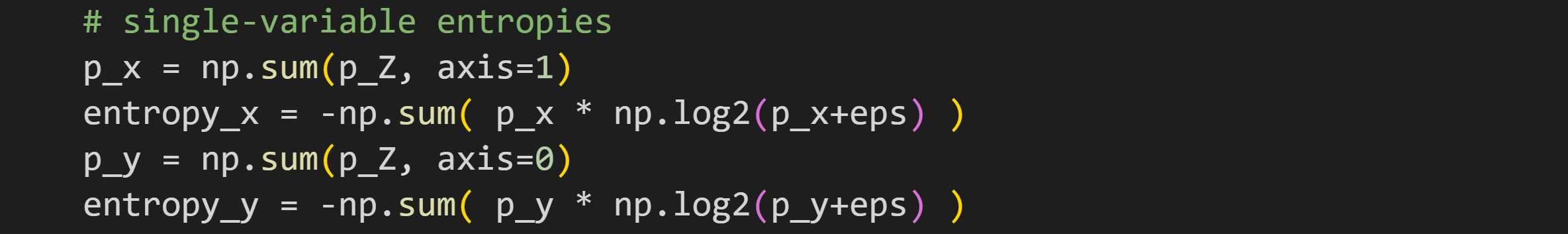
It might not be obvious that p_x and p_y are real probability distributions; I encourage you to confirm this in the code by checking that all the values in p_x sum to 1.
And now for mutual information. Mutual information is simply the joint entropy minus the single-variable entropies. In other words, it’s the total entropy in the two-variable system, minus the entropy attributable to either variable alone.

The capital letter I is used for mutual information. I suppose the “I” is for “information,” which would make more sense that “H” for “entropy” (unless it’s really spelled “hentropy” and the “h” is silent outside Australia).
The equation (Hx+Hy-Hxy) may seem inconsistent with my written explanation as “joint entropy minus the single-variable entropies.” However, remember that entropy is calculated with a minus sign to make it a positive quantity. Without those interpretational minus signs, the formula for entropy is joint entropy minus the two individual entropies.
In other words, mutual information quantifies the question: What information is shared between the two variables that cannot be attributed to either variable alone?
Demo 3: Mutual information
I’ll show two ways to calculate mutual information: using a direct translation of the equation, and using a Scikit-learn implementation that is based on a robust estimation (Scikit-learn is a Python library for machine-learning).
Let’s start with the direct implementation. Once you have the two single-variable and joint entropies, calculating mutual information is straightforward:

Next is the SKlearn implementation. The function for mutual information with at least one continuous variable is called mutual_info_regression().
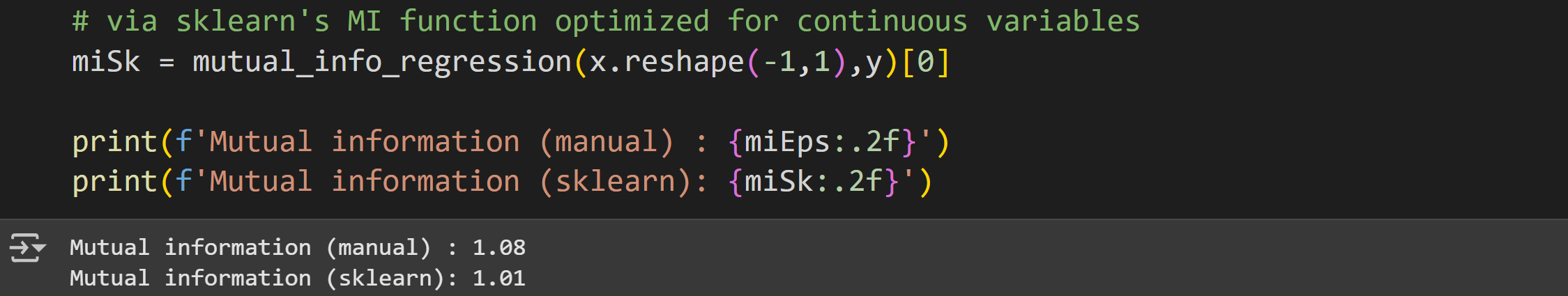
Notice that this implementation takes the two variables as inputs (for annoying housekeeping reasons, the first input must be a multidimensional array, not a dimensionless array; hence the reshaping). It does not take a discretization or number of bins as input. Instead, the SKlearn function uses a robust estimation method based on nearest-neighbor clustering.
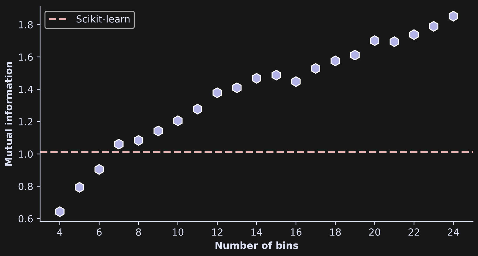
The two results are similar but not identical. Perhaps the binning resolution has something to do with the discrepancy?
Yes it does :)
I ran an experiment in which I calculated mutual information on the same data, multiple times, using different grid resolutions. This involved pasting the code I showed earlier into a for-loop over a range of bins from 4 to 24. As you see in Figure 7, mutual information increased monotonically (small noise-driven fluctuations notwithstanding) with increasing bins. That’s not surprising given the same effect on entropy that you saw earlier.
Before reading about demo 4, check out the video walk-through of demo 3!
Demo 4: Statistical significance via permutation testing
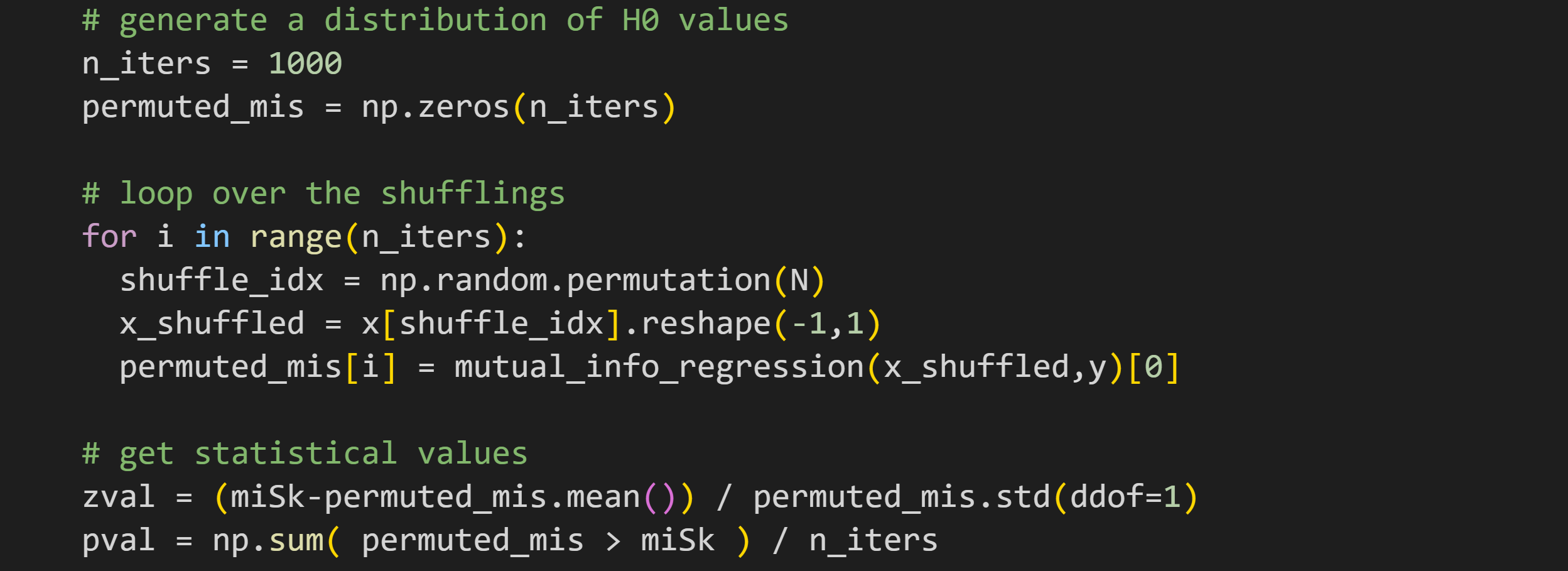
Statistical significance can be calculated using the same permutation-based approach as in the previous post: Randomly shuffle the pairing of the two variables, and re-calculate mutual information; repeat 1000 times to generate a H0 distribution; calculate the z-score distance and p-value of the observed mutual information value relative to the permutation distribution.
I hope the code below looks familiar; it’s nearly identical to the code from the previous post, except calculating mutual information instead of covariance.
In this case, the (nonlinear) relationship between x and y is so strong that the mutual information is wildly significant (see Figure 8).
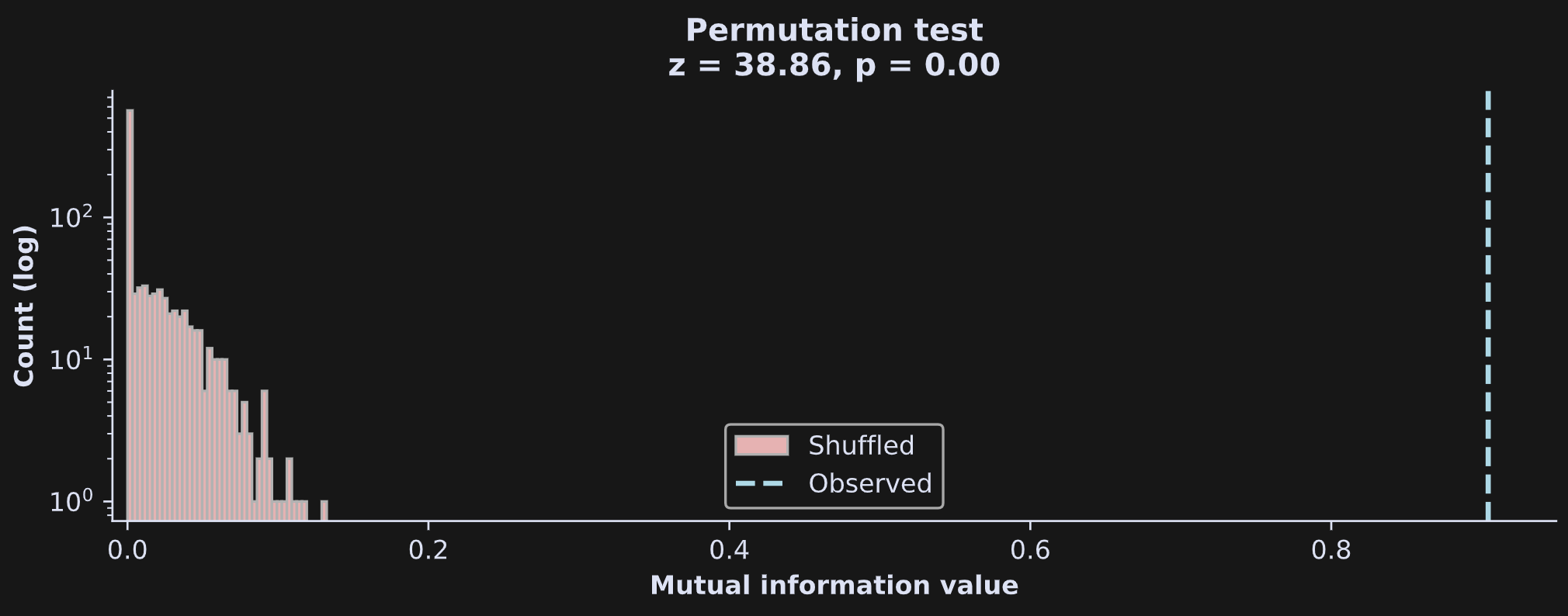
It is debatable whether the z-score is an appropriate metric in this example: Z-scoring is based on the mean and standard deviation, and the shape of the H0 distribution is far from Gaussian. Nonetheless, z-scoring the distribution gives a clear sense of the magnitude of the bivariate relationship in the data, and the counting method of the p-value is not based on any assumptions of distribution shape.
In this example, the z-score is HUGE, not because the observed mutual information value on its own is so high, but because the permuted H0 distribution is so tight and close to zero. Of course, that’s not surprising, given how I simulated the data. You’ll see more ambiguity of statistical interpretations in the next post, where I’ll use real data.
You guessed it: This is where you can switch from reading to watching the video for demo 4 at the bottom of this post. Enjoy!
Demo 5: Impact of outliers
The last topic I want to cover in this post is the impact of outliers on mutual information. As with the discussion of covariances, the impact of outliers on mutual information is a nuanced issue, and it is not possible to make general statements about the precise impact of outliers, except that outliers can negatively impact the accuracy of the mutual information estimate. Depending on the location and severity of the outliers, the mutual information estimate can be larger or small than the true mutual information.
To illustrate this, I added one outlier to x and one outlier to y, same as in the previous post.

I then calculated mutual information using the manual implementation and using SKlearn’s regression-based estimate, in four scenarios:
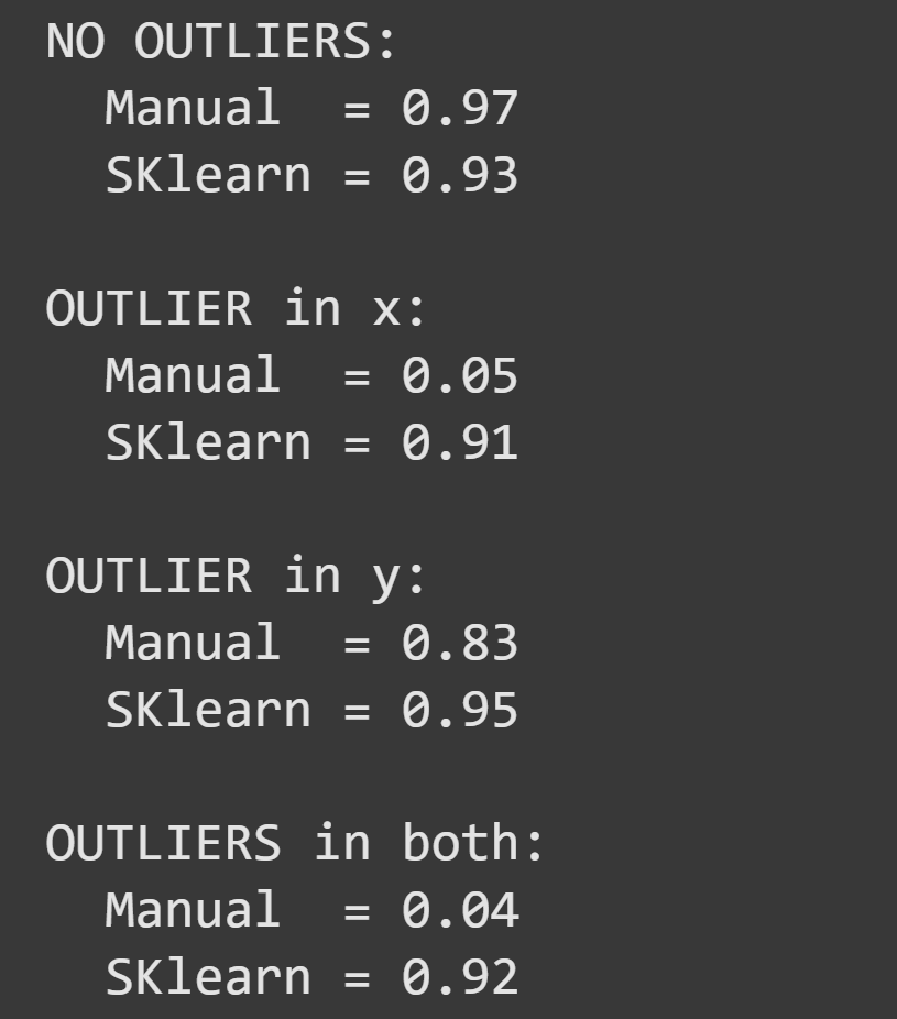
Two questions about this result: (1) Why is the outlier on x so much more impactful than the outlier on y? (2) Why was the SKlearn method less adversely affected than the manual method?
The answer to the first question is clear from looking at the graph of the data with outliers:
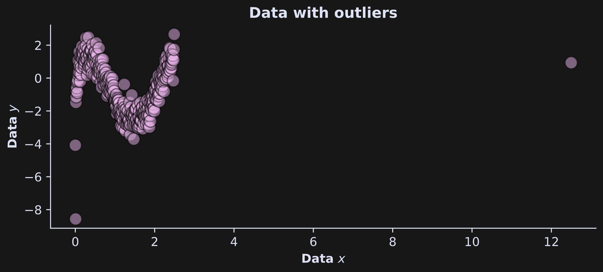
The outlier on x is much more extreme than the outlier on y. Hopefully, in a real data situation, that outlier would be identified and removed. This example also highlights the importance of data visualization.
The answer to the second question is that the SKlearn function uses an robust estimation method based on nearest-neighbor clustering. Outliers make small contributions to the final estimate because their contribution is pulled towards their nearest neighbors. In contrast, that distant outlier skews the discretization and forces the 2D histogram to have more grids with little or no data, and fewer bins to capture the higher concentration of data.
From this discussion, I can imagine you’re thinking that you should always use the SKlearn implementation and never use the “manual” approach. In many cases, that is a valid conclusion, and robust estimators are usually preferred over more sensitive formulas. However, the SKlearn implementation can be quite time-consuming. That’s not noticeable here because there is only one dataset with a fairly small sample size. If you are processing a large amount of data, the SKlearn implementation may become prohibitively time-consuming, in which case it will be better to use the manual implementation in combination with data cleaning.
The last video for this post is at the bottom. Keep scrolling!
When to use mutual information
At first glance, it may seem like mutual information is better than covariance: it measures both linear and nonlinear interactions and can be more robust to outliers (given that certain estimators are used).
However, mutual information also has some disadvantages, namely:
It cannot distinguish positive vs. negative relationships
It is not computed directly from the data, but instead from an estimate of the probability distribution of the data. This makes mutual information more computationally complex than covariance, which in turn means that the mutual information estimate will differ for different algorithmic implementations and parameter selections.
Mutual information has no analytic null-hypothesis distribution, which means that statistical significances like p-values can be obtained only through computational methods like permutation testing or bootstrapped confidence intervals.
I hope this section doesn’t come across as negative — mutual information is a powerful and popular way to measure nonlinear interactions in machine-learning, optimization, deep learning (including large language models), and computational sciences including physics and genetics.
Join me for the final part!
I hope you’re not too sad to reach the end of this post, because it’s been such an amazing learning adventure ;)
But the action continues in the finale of this trifecta!
In Part 3, you’ll see how mutual information and covariance are related to each other for variable pairs with linear independencies, and you’ll see examples in real data. I’ll also use the pandas library to store the data, and seaborn to visualize them.
Detailed video walk-throughs
Below the paywall below are the videos I keep mentioning :P If you’re a paid subscriber, then thank you for your generous support! It helps me continue to focus my professional time on making educational content like this.
Keep reading with a 7-day free trial
Subscribe to Mike X Cohen to keep reading this post and get 7 days of free access to the full post archives.