
Two-variable dependence part 3: Covariance vs. mutual information
Compare linear and nonlinear statistical dependence measures

About this three-part series
I wrote this post series because many people are confused about how covariance and mutual information are related to each other, and when to use which one. It’s an understandable confusion: both covariance and mutual information measure the relationship between two variables. But they really are different, and have different assumptions, provide different insights, and are used in different applications.
In Part 1 you learned about covariance, which is the most commonly used measure of linear dependencies.
In Part 2 you learned about mutual information, which is the most commonly used measure of nonlinear dependencies.
And now in this grand finale, you’ll see a direct comparison between covariance and mutual information in simulated and in real data.
Follow along using the online code
Only the essential code snippets are shown in this post; the full code file to reproduce, extend, and adapt the analyses are in the code file on my GitHub. It’s one Python notebook file for the entire post series, so you’ll need to scroll down towards close to the bottom of the notebook file to get to the code for this post.
Detailed video walk-throughs
As in the previous post, there are detailed video walk-throughs of the demo code, in which I provide deeper insights into mutual information. The videos are at the bottom of this post, and are available to paid subscribers.
Demo 1: Covariance and mutual information in simulated data
I’d like to start with simulated data. The advantage is that we can control the nature and size of the true effect in the data, as well as the amount of noise, in ways that are impossible to do in real data.
The goal of this demo is to compare covariance and mutual information in datasets with known linear interactions.
I discussed how to generate correlated random variables in more detail in my post on correlation vs. cosine similarity; briefly, the idea is to draw random numbers from a normal distribution, define y to be a copy of x plus additional random numbers, and set the contribution of x and q based on the desired correlation coefficient R.

After using those formulas to generate datasets, I calculated the covariance and mutual information between x and y, for many datasets that had different values of R ranging from -.9 and +.9.
There are two important take-home messages from Figure 1: first, mutual information is always positive, even when the correlation (and covariance) are negative. Second, mutual information is very similar to squared covariance.
This shows that mutual information and covariance are really similar to each other — when the relationship between the variables is linear.
When there are nonlinear relationships, then covariance will reflect any linear part of the relationship whereas mutual information will capture both the linear and nonlinear dependencies. You saw examples of that in the previous post (e.g., Figure 1).
I recorded a video where I discuss the code and the concepts in more detail. There is a similar video for each of the demos in this post. Paid subscribers can access all of the videos by scrolling down to the bottom of the post.
Demo 2: Download and process a real dataset
I selected a public dataset about bike-share rentals in Seoul. The dataset contains information on the number of bikes rented over a year, along with data about weather and time of day. The purpose of the dataset is to predict bike-rental demand, although we will use it here to explore covariance and mutual information in real data.
The full citation and link to the dataset are in the online code file.
I used pandas to import the data:
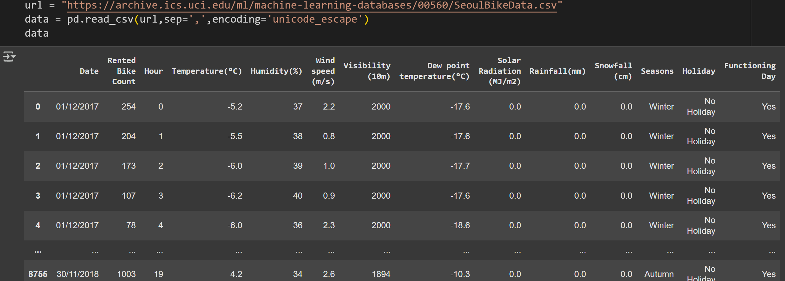
There are 8760 rows of data and 14 features. I will focus on five features:
Rental count (number of bikes rented each day)
Temperature in °C
Wind speed
Days since the first recorded day (the dataset comprises a bit over a year of data)
Humidity
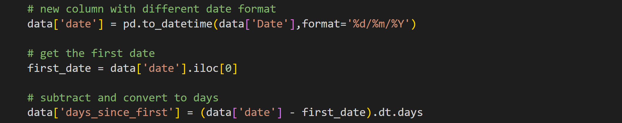
That fourth feature (days since beginning) is not a variable in the original dataset. The dates are initially stored as day/month/year. To calculate the number of days since the start of the study, we need first to convert the date into pandas’ preferred format, and then subtract from the first date.
The second processing step is to create a new dataset with only the columns I want to focus on. This step is actually not necessary, but it does simplify the rest of the analysis code.

Notice also that I copied the data into a new dataframe instead of overwriting the original variable.
Here are some summary statistics of the data:
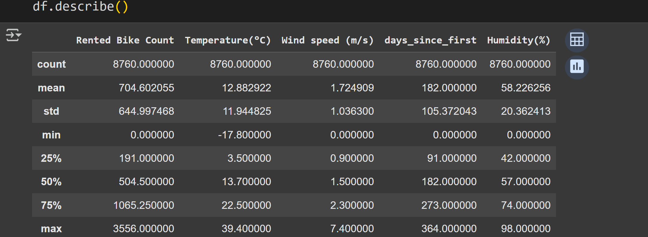
Staring at a table of numbers is informative but… not really the best way to understand the data.
The seaborn library has a nifty plotting function called pairplot that creates a matrix of subplots showing the scatter plots of each data pair and histograms of each variable on the diagonal (Figure 2).
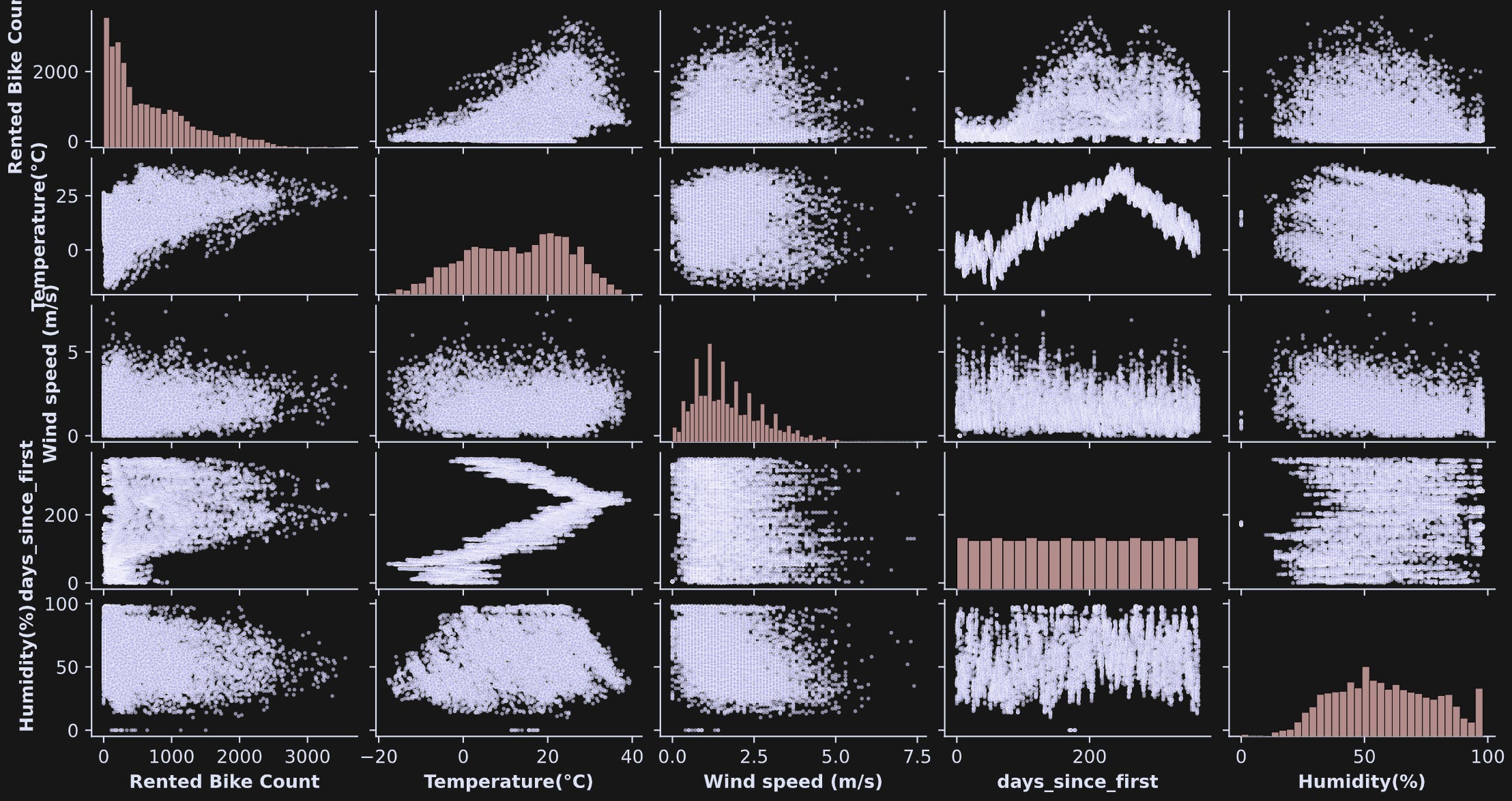
pairplot function is a great way to explore bivariate relationships in multivariable datasets.Interesting to see so many shapes of the distributions! Some look more Gaussian, some uniform; many don’t easily fit into mathematically defined distributions.
Also notice the three-order-of-magnitude differences across the numerical values of the variables. That’s not a problem per se, but will be relevant for interpreting the covariance results.
If you’re a paid subscriber, you can scroll down to the bottom of the post for the detailed video explanation of demo 2.
Demo 3: Split-half reliability of covariance and mutual information
There are two goals to this demo: (1) adapt code from previous posts to calculate pairwise covariance and mutual information, (2) perform a split-half reliability analysis.
A reliability analysis is a general term in statistics for assessing whether a particular result is robust. There are many kinds of reliability analyses; “split-half” means to split the dataset into two equal-sized parts, perform the same analysis on both parts, and then compare the results. If the two results are the same, then the analysis is robust; if the results are different, then the analysis is not robust, perhaps because the data are too noisy to be reliable.
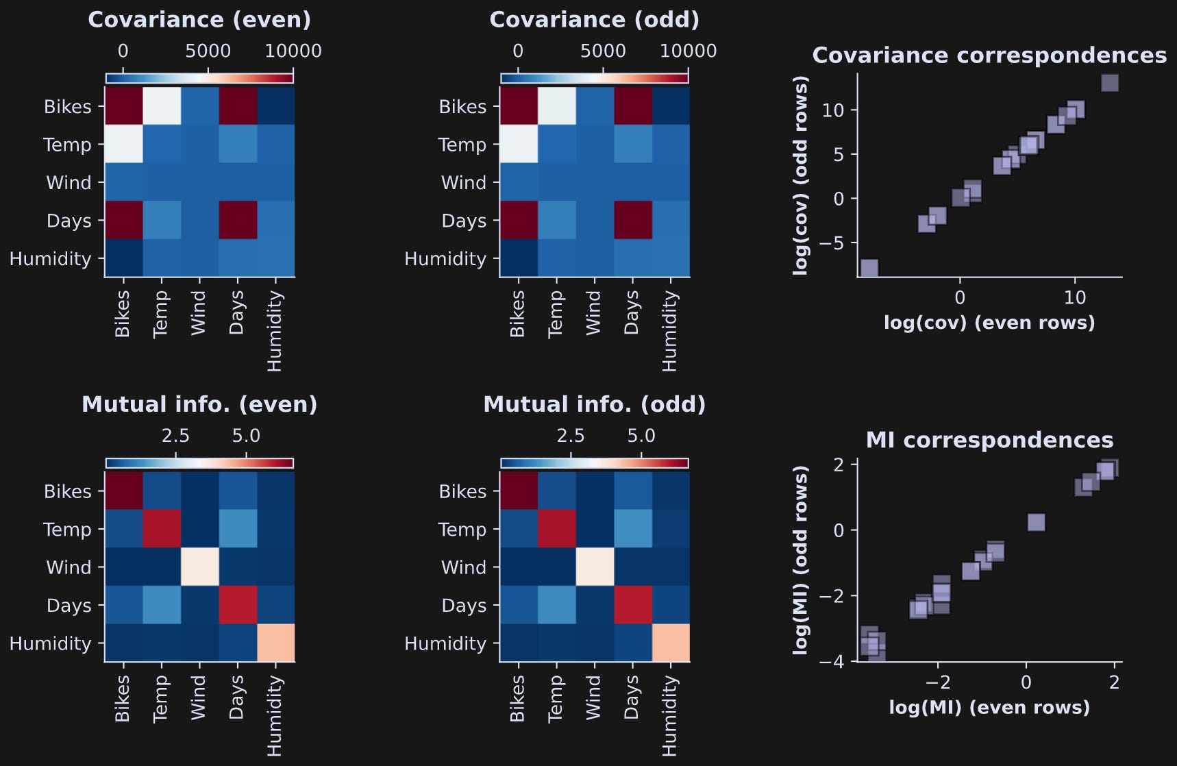
Here I split the data into two parts by separating the even row-numbers (that is, rows 0, 2, 4, …) from the odd row-numbers (rows 1, 3, 5, …). I calculated covariance and mutual information in all pairs of variables, and stored the results in a matrix. Part of that code looks like this (variable M is the number of data features, which here is 5).
In the online code file, you’ll see this code repeated but for the odd-indexed trials.
Note that the second for-loop (looping index j) starts at variable i instead of at 0. Covariance and mutual information are both symmetric (non-causal) measures, so we don’t need to run the analysis for each pair twice. On the other hand, I do want full matrices for the visualization, which is why I copy the analysis result from the upper triangle to the lower triangle.
Figure 3 shows the results. The top row shows covariances and the bottom row shows mutual information values. The scatter plots on the right show the even results by the odd results. They are nearly identical, which means the bivariate measures are highly reliable (visually slightly less reliable for the mutual information, although the correlation between even and odd is still very high).
Some observations:
What do the diagonals mean in the images? The covariance of a variable with itself is simply the variance. How about mutual information? The mutual information of a variable with itself is its entropy. That’s pretty neat.
The covariances differ by several orders of magnitude. That’s because the units of covariance are the product of the individual units. The “bikes” variable has very large numerical values because it encodes the number of bikes rented across the entire city. “Days” also has large units, because the data collection period spanned a bit over a year.
On the other hand, mutual information does not have units of the variables, because it is calculated from probabilities of data values, not the data values themselves. (The unit of mutual information is called bits.) Therefore, the numerical values are in a smaller range.
The spread of covariance values is so large that the test-retest scatter plot in the right-most column was difficult to visualize. So I transformed the data to log-scale. That’s fine for mutual information, which is a non-negative quantity. But covariance can be positive or negative, so I did a “trick” of taking the log of the absolute value, times the sign of the original values: sgn(c)ln(|c|). That’s called the “signed log” transform.
In Demo 1, you saw that mutual information and squared covariance were very closely related when the data contain linear interactions. That was in simulated data where I specifically crafted the data to have only linear interactions.
Let’s examine the relationship between covariance and mutual information in the real data.
To run this analysis, we need to extract the unique elements in the pairwise covariance and mutual information matrices.

The first line of code returns the (i,j) indices into a matrix that extracts the upper-triangle (without the diagonal). We can use those indices to extract the unique off-diagonal elements of a symmetric matrix. The next two lines of code extract those elements for the squared covariance and mutual information. The .mean(axis=-1) method averages over the odd-indexed and even-indexed rows. Those two results were so similar to each other that I decided it’s easier to average them than to separately analyze them.
Anyway, the point is that the code above gives us vectors of the pairwise squared covariance and mutual information values, and we can correlate them as we did in the simulated data (Figure 4).
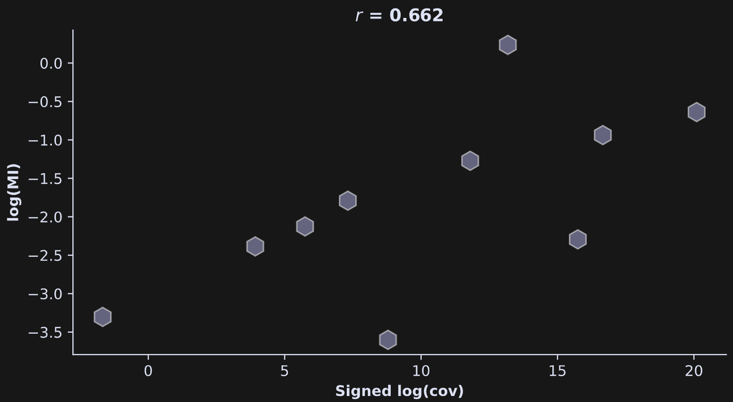
The relationship between mutual information and covariance has a respectable strength (r=.66), although it’s not nearly as impressive as in the simulated data.
What does that mean?
It means that the data contain both linear and nonlinear relationships; both mutual information and covariance captured the linear interactions, while the mutual information additionally captured the nonlinear interactions.
More explanations in the video walk-through of Demo 3! Scroll down!
Demo 4: Statistical significances
And now for the final demo: statistical significances using permutation testing. The goal here is to use permutation testing to get z- and p-values for each pairwise test.
Part of the code for these tests comes straight from the previous posts. But there are additional considerations here, partly due to the larger number of comparisons (there are 10 tests in total for each measure), partly due to the data being stored as a pandas dataframe instead of a numpy array, and partly due to the computation time of the mutual_info_regression function.
The code below is embedded in a double for-loop over the data features.
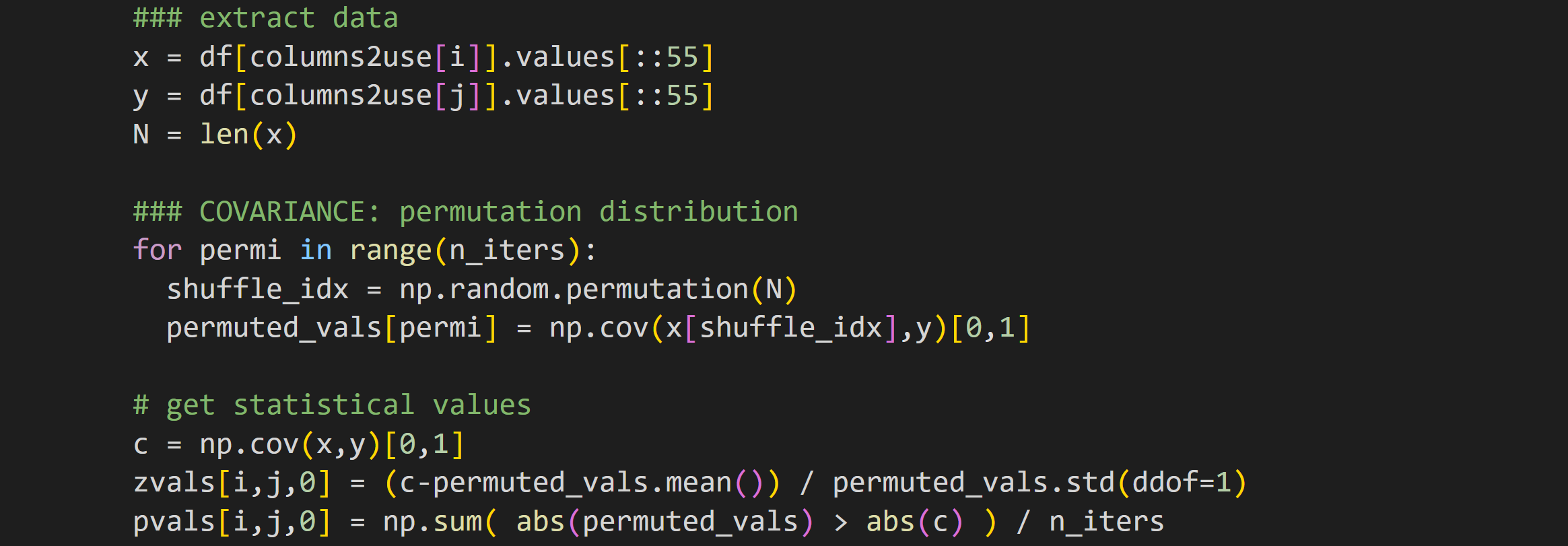
The data extraction isolates the two columns under consideration. Extracting the .values instead of leaving the data as a pandas Series data type makes the slicing easier — you can see that I take only every 55th row for the analyses.
But why do we even need to slice the data? That’s partly for computation time, so the analysis runs in seconds instead of minutes, and partly because the enormous number of data points (almost 9000!) makes every analysis wildly significant, even if the effect sizes are miniscule. I’ll get back to this later.
The rest of the code in that block should look familiar: randomly shuffle the pairing of x and y, calculate the covariance, and then calculate the z-score and p-value of the observed finding relative to the H0 distribution.
That code block is then repeated but calculating mutual information instead of covariance.
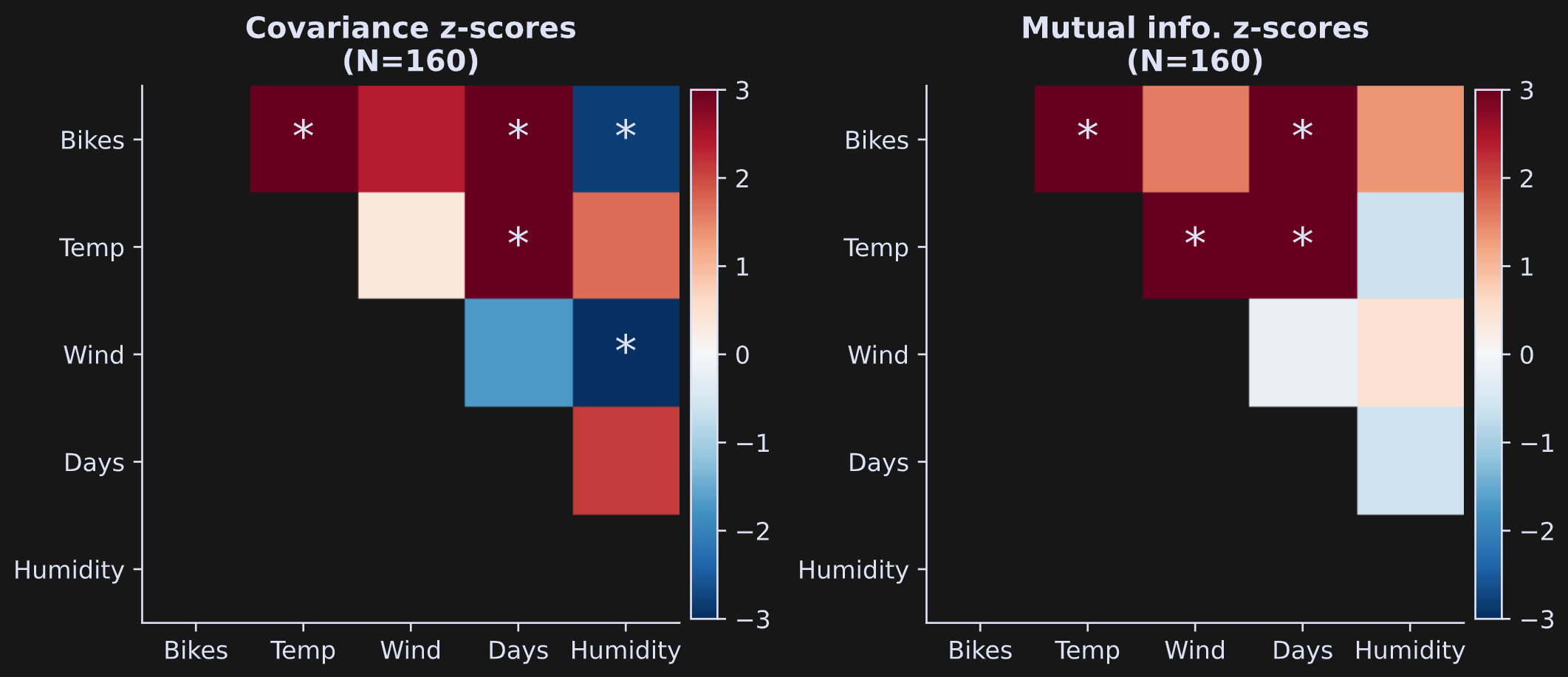
The results are shown in Figure 5 below. Each colored block indicates the statistical z-score of that analysis, and asterisks are drawn on top of blocks that are statistically significant using a p-value threshold of .05/10 = .005 (dividing by 10 is Bonferroni-corrected for multiple comparisons).
One general issue in statistics is that very small effects can be highly statistically significant in very large sample sizes. This is illustrated in Figure 6, which is the same analysis and the same code that generated Figure 5, but using all data rows (note: the code block takes around 5 minutes to run with 500 permutations).
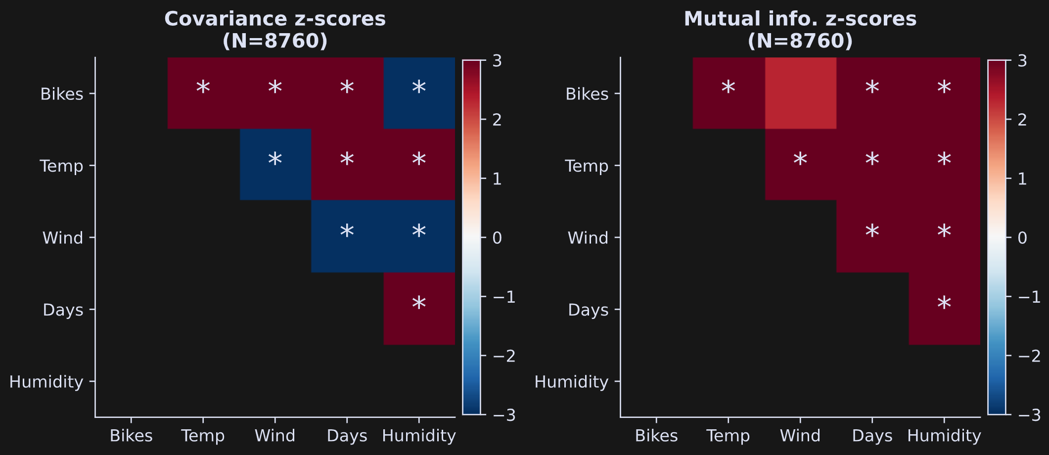
By increasing the sample size, nearly every finding is highly significant; indeed, the color scaling of the z-score is saturated.
Figures 5 and 6 show only the statistical values, not the covariance or mutual information values. That raises the question of whether the estimates changed with the full dataset vs. the subset. See Figure 7.
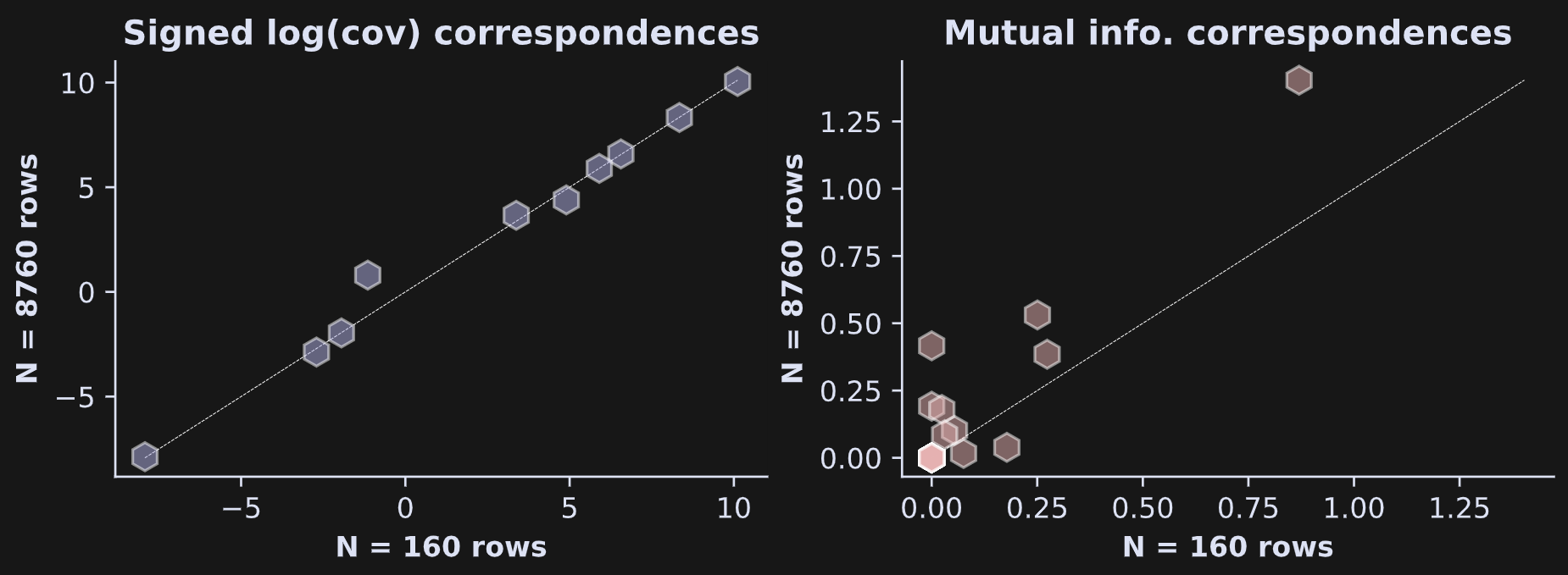
It is striking that the covariance estimate is nearly identical in the data subset vs. the full dataset, whereas the mutual information estimates are noticeably different in the subset vs. the full dataset.
The reason for the discrepancy is that covariance is calculated directly from the data whereas mutual information is calculated from the estimate of the probability distribution of the data. Less data means lower estimation quality. The test-retest reliability was higher because the trial counts were matched in the two split halves.
Subscribers can scroll down for the video of demo 4.
You’ve seen in this post series that results can change with different analysis parameters, such as grid resolution and trial count. You may find that troubling, or at least annoying. If that’s how you feel, then I agree. The best I can say is that it’s normal: Data science is more an art than a science.
THE END
Thank you for joining me on this adventure! I hope you found reading these posts an enjoyable and educational way to pass the time.
Detailed video walk-throughs
Below the paywall below are the videos I keep mentioning :P If you’re a paid subscriber, then thank you for your generous support! It helps me continue to focus my professional time on making educational content like this.
Keep reading with a 7-day free trial
Subscribe to Mike X Cohen to keep reading this post and get 7 days of free access to the full post archives.