
Correlation vs. best-fit line (regression)
The relationship between correlation and regression is both simple and complicated.

There is a misconception that the correlation coefficient is the slope of a best-fit line in a scatter plot of two variables. That’s incorrect… well, it’s mostly incorrect. Sometimes it’s true but only if the data have just the right characteristics.
The main goal of this post is to explain the relationship between the best-fit line and the correlation coefficient. Along the way, you’ll learn the calculus of regression and see lots of code demos.
Warning: There is more math in this post than my typical post. I try to explain all the equations, and I tried to inject enough code demos that it provide a successful balance between difficult concepts and fun simulations and visualization. But it is the case that a rigorous explanation of the relationship between correlation and regression requires some serious math.
How to learn from this post
I wrote a Python code notebook file that accompanies this post. Here’s the direct link, and the video below walks you through getting that code file into Google’s colab environment (a cloud-based Python environment, so you can run the code without installing anything locally).
You can read and learn from the post without even looking at the code, but if you’re familiar with Python, then you’ll learn a lot more by going running the code while reading the post.
Correlation coefficient (math and pictures)
The goal of a correlation analysis is to compute a correlation coefficient. This coefficient is indicated using r, and is a number that encodes the normalized strength of the linear relationship between two variables. The normalization imposes boundaries of -1 to +1. Negative, zero, and positive correlation coefficients have distinct interpretations:
0<r≤1 indicates a positive relationship, meaning both variables increase and decrease together (e.g., taller people tend to weigh more).
r=0 indicates no linear relationship, meaning that you cannot predict the value of one variable based on the other. The “linear” qualification is important because non-linear relationships can exist in variables with r=0. Nonlinear relationships can be measured using mutual information, which I’ve written about in this post.
−1≤r<0 indicates a negative relationship, which means that one variable increases when the other decreases.
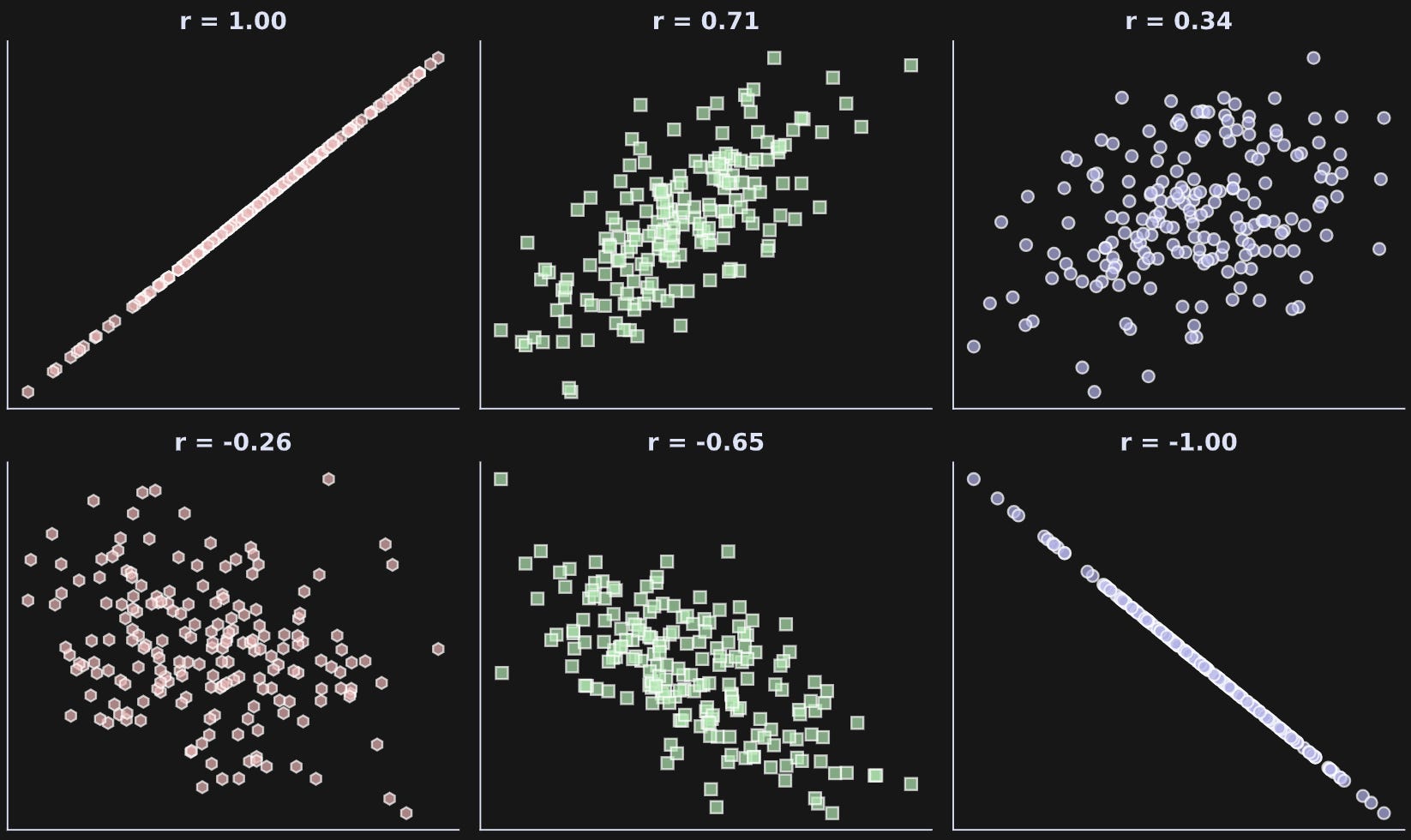
As the magnitude of r increases (that is, gets further from zero), the strength of the relationship increases. The figure below shows several examples of correlations with different magnitudes and signs.
Where does that correlation coefficient (r) come from? Well, it comes from the numpy function np.corrcoef :P
But that python function implements the following mathematical formula.
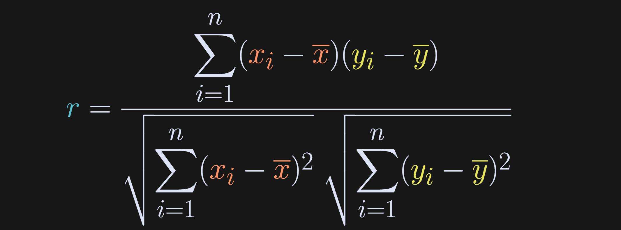
The numerator is the dot product between the mean-centered variables (dot product is elementwise multiplication and sum), and the denominator is the product of the standard deviations of the individual variables.
If you’ve take a machine-learning or statistics course before, then I’m sure that equation looks familiar. I’m going to rewrite that equation in a way that will help reveal the link between correlation and regression later in this post. First to define some variables.
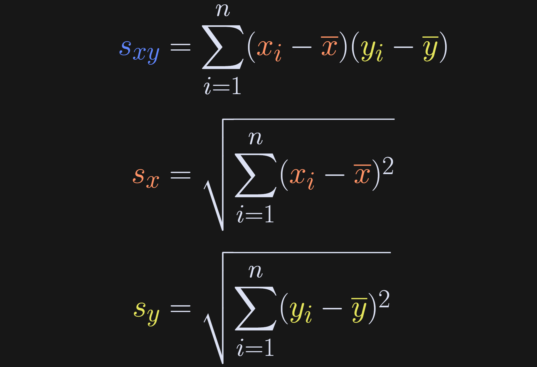
Basically, I’ve just shortened the covariance and standard deviation terms to s. And that gives us our rewritten expression for the correlation coefficient.

This equation clarifies that a correlation coefficient is the covariance between two variables, scaled by the product of their standard deviations.
One more comment about the numerator of the correlation before moving on: The summation is over index i, and the averages don’t depend on i. That means we can rewrite s_xy as the following:

In other words, summing x̅ n times is simply nx̅. This may seem like a minor and confusing rewrite, but it turns out to be crucial for linking regression slopes to correlation coefficients.
Code demo 1: Intuition for correlation
(If you’re a paid subscriber, scroll down to the bottom of this post for a detailed video walk-through of this code demo.)
The intuitions that I hope you got from Figure 1 include: (1) positive correlation means the two variables go up and down together; (2) negative correlation means one variable goes up while the other goes down; (3) correlations of ±1 are perfect relationships while correlations between 0 and 1 mean that one variable is not perfectly predictable from the other.
The code below produces Figure 1. Please try to understand what the code does based on visual inspection, before reading my explanations below (reminder that you can get the full code online from my GitHub repo).
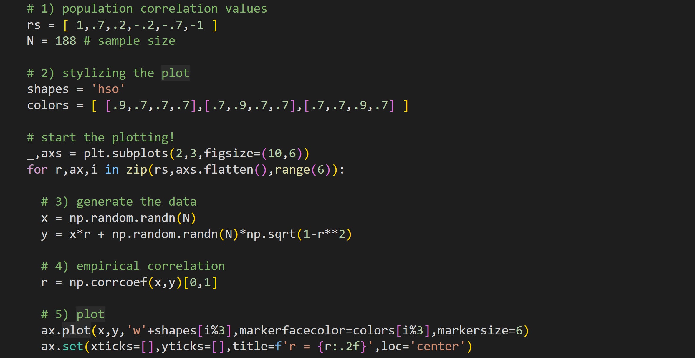
Here I define the population correlation coefficients and the sample size. The dataset generated in the for-loop will be 188 data pairs sampled from populations with those correlation values. That means that the sample correlation won’t exactly equal the population correlation, but should be a reasonable approximation.
There are six plots in total and here I define three marker shapes and colors (RGBA values). In the plot I take the looping index modulus 3 (
i%3in step 5), which loops around the colors.Here’s where I generate two random variables sampled from a population with a correlation of
r. I talk more about that formula and why it works in a separate post.Calculate the sample correlation coefficient. np.corrcoef returns a 2x2 correlation matrix, so I index only the off-diagonal element.
Draw the data in a scatter plot. You can compare the empirical sample correlations to the specified population correlation.
That’s it for the correlation. I’ll now discuss the math, intuition, and coding of defining a best-fit line from a regression analysis.
Simple regression (math)
The goal of a regression analysis is to predict a continuous variable (such as height, income, house price, stock market value) based on one or more other variables.
The regression equation is the following (subscript i indicates each data point):

β₀ is called the “intercept” and β₁ is called the “slope.” The ε is the residual or error term. It captures all the variance in y that cannot be explained by the model.
A note about terminology: A regression is called “simple” when it has only two parameters (intercept and slope) and is called “multiple” when it has more than two parameters. The relationship between slopes and correlations is more complicated for multiple regression due to possible interactions between variables. Therefore, in this post I’ll focus on simple regression.
The two parameters combine to give us the predicted data, which is also called the best-fit line.

There is no ε term, because this is the predicted data. It’s a straight line that goes through the scatter plot.
The goal of a regression analysis is to find the two β parameters that make the model best fit the data. I’ll explain that solution later in the post, but first I want you to build some intuition for regression by generating a regression model and simulating data.
Code demo 2: Intuition for simple regression
(Paid subscribers can scroll can find a detailed video walk-through of this code demo at the bottom of the post.)
The purpose of this demo is to simulate data that you would analyze with a regression analysis. We will first create the data, and then run a regression analysis in scipy.stats to see if we can recover the ground-truth parameters.
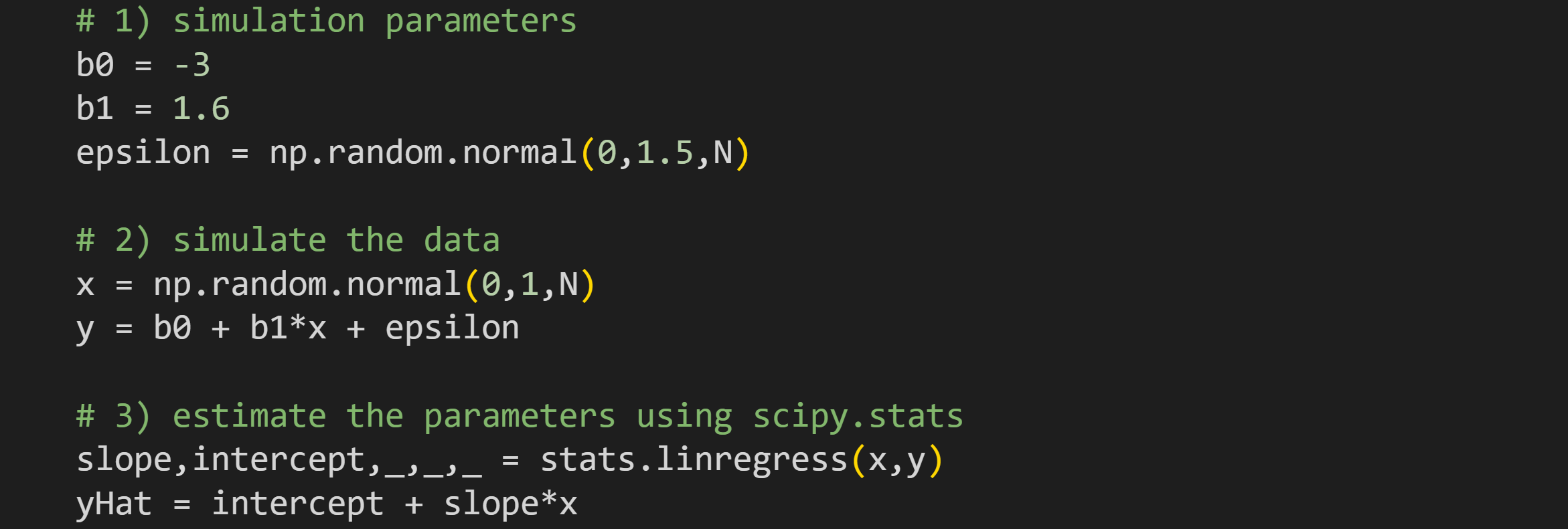
To simulate regression data, specify the two regression parameters and the “unexplained variance” (ε), which is generally modeled as random numbers. The code uses the sample size (
N) parameter that was specified in the correlation simulations.Simulate the data. Variable x is random numbers while variable y is a function of x. Notice that y is the direct translation of the regression equation I showed earlier. For this example, I’m defining x as normal random numbers, but in practice, x is defined based on the application. For example, if you’re modeling weight loss from exercise minutes per week, then you might simulate x as integers between zero and 300.
I will explain the math of finding the two β parameters below; here I’m using the
linregressfunction inscipy.statsto calculate the values. Ideally, the outputs of that function (variablesslopeandintercept) should matchb1andb0exactly.
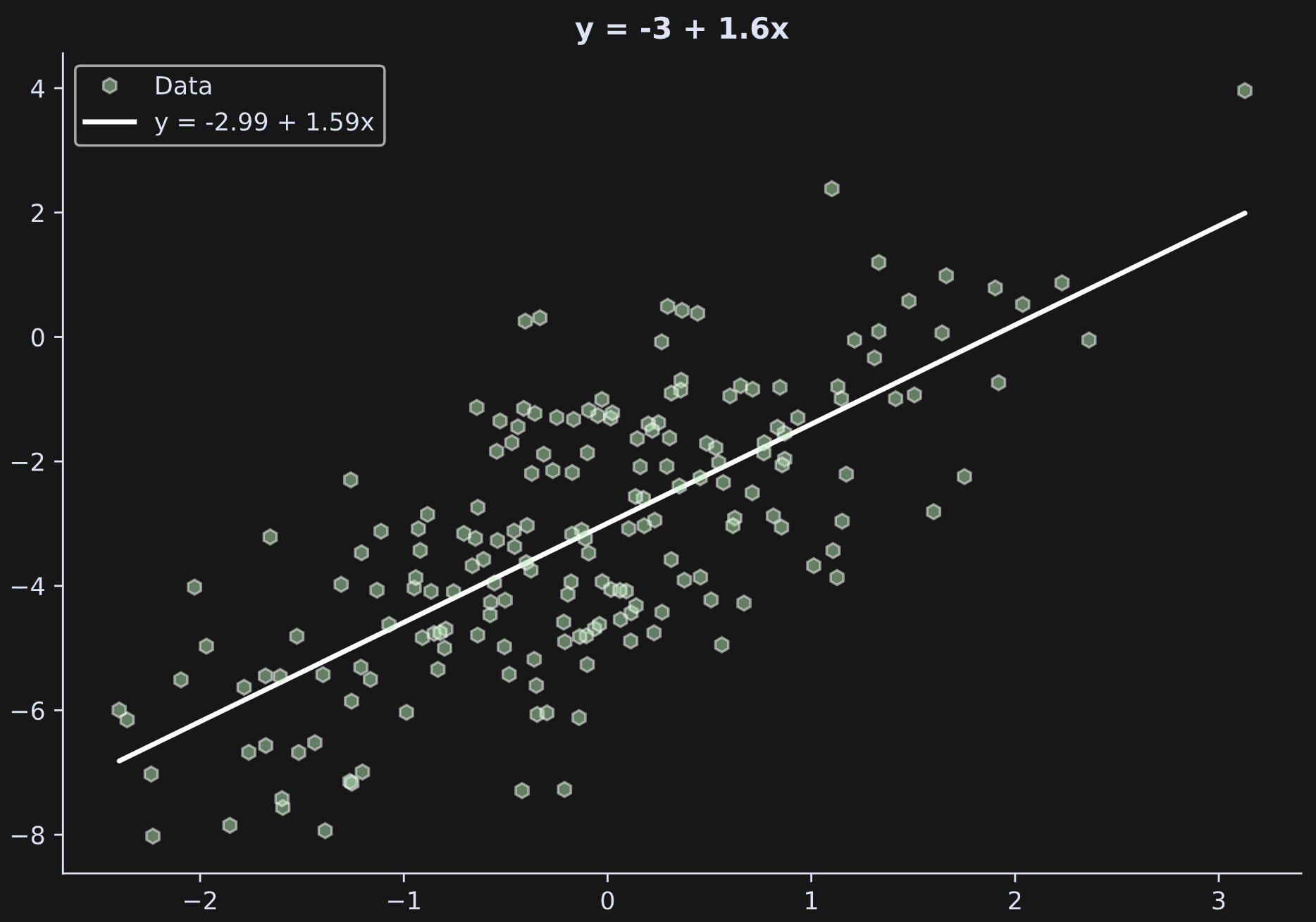
Let’s have a look at the output:
b0 (truth): -3.0000
b0 (esti.): -2.9936

b1 (truth): 1.6000
b1 (esti.): 1.5934
The results are close but not exact. Characteristics of sampled data rarely match the population values perfectly. Larger sample sizes and smaller noise (lower standard deviation in epsilon) will give more accurate results.
The figure below shows the data and the best-fit line created from the regression parameters.
The mathematics of regression
The goal of this section is to explain the mathematical solution to finding the regression parameters. I realize that this may initially seem like I’m veering away from the main purpose of the post (the relationship between the best-fit line and correlation coefficient), but it turns out that solving the regression problem reveals that relationship.
We have values of x and y from the measured data. The question is how do we solve for the β terms? Intuitively, we want to find the values of β that make the model fit the data as well as it can. The parameter calculation can be explained using linear algebra or calculus; both offer unique insights and lead to the same conclusion. I’ve discussed the linear algebra solution in this post; the calculus solution that I’ll present here is more insightful to linking regression and correlation.
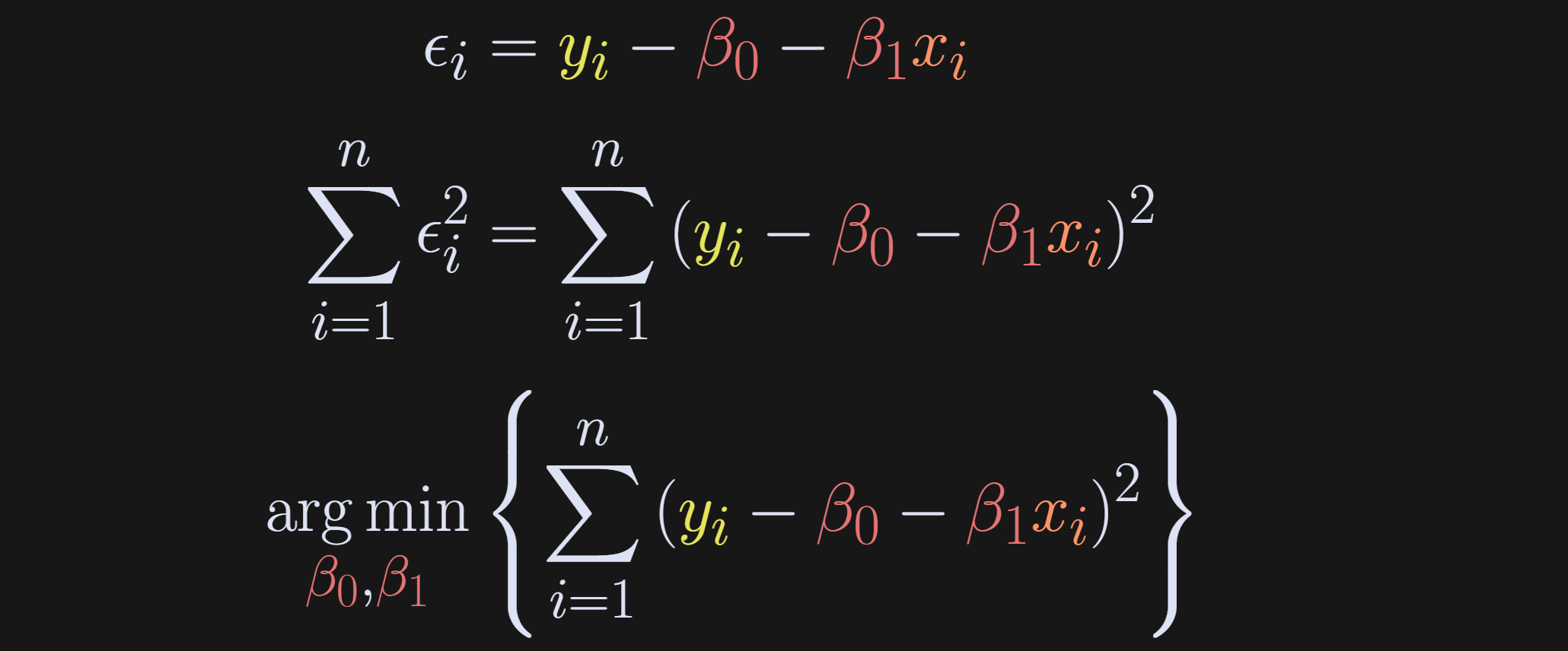
Back to the intuition: We want to find the model parameters that best fit the model, which is the same as saying the parameters that minimize ε. Because the errors can be positive and negative (and for other calculus reasons I’ll explain in a moment), we actually define the objective as minimizing the squared errors. And we don’t just want one error to be small — we want the sum over all the errors to be small. That’s what the equations below depict: Rewrite the regression to solve for ε, then setup an optimization problem to find the β’s that minimize ∑ε².
Now the question is how to solve that optimization problem. The calculus approach is to differentiate the expression, set it to zero, and then solve for the β terms. We need to solve separately for the two β terms; I’ll start with β₀. Try to follow the equations below and then read my explanations of each numbered equation. (btw, the summations are all from i=1 to n, so I’m dropping the sub- and super-scripts.)
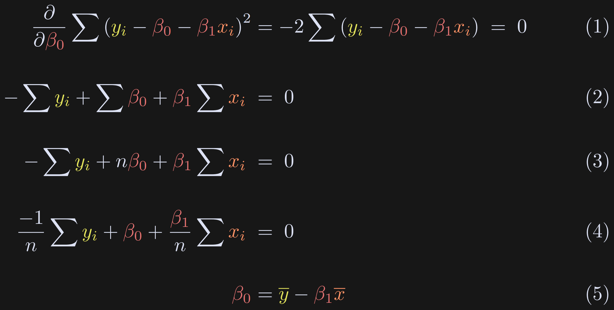
Take the partial derivative with respect to β₀. There is a squared term, so we need the chain rule. Differentiating a square is really easy (bring down the power), whereas differentiating the absolute value is a bit trickier. That’s one of the reasons why we solve for the squared error instead of the absolute error. The minus sign outside the summation comes from differentiating -β₀. Now the goal is to solve for β₀.
Drop the “2” (divide on both sides) and expand the parenthetical.
Notice that ∑β₀ in Equation 2 is just the intercept summed n times. (Alternatively, you can think of pulling out the constant β₀ and summing “1” n times.)
We need to solve for β₀, so I divide the entire equation by n. That’s pretty neat for the summation terms, because we have sums and then we divide by n. That’s just the average.
Here I replace the sum(x)/n with x̅ and isolate β₀.
This is a really neat result: The intercept is literally just the difference between the means of the variables after scaling x̅ by β₁. Even before solving for β₁, Equation 5 proves that the intercept term equals zero when both variables are mean-centered.
Next we will find a formula for β₁. The procedure is the same as above (differentiate and solve), although the solution is different because of the xᵢ term. I’ll break up the procedure into two blocks. Again, please try to understand the sequence of equations below before reading my explanations.
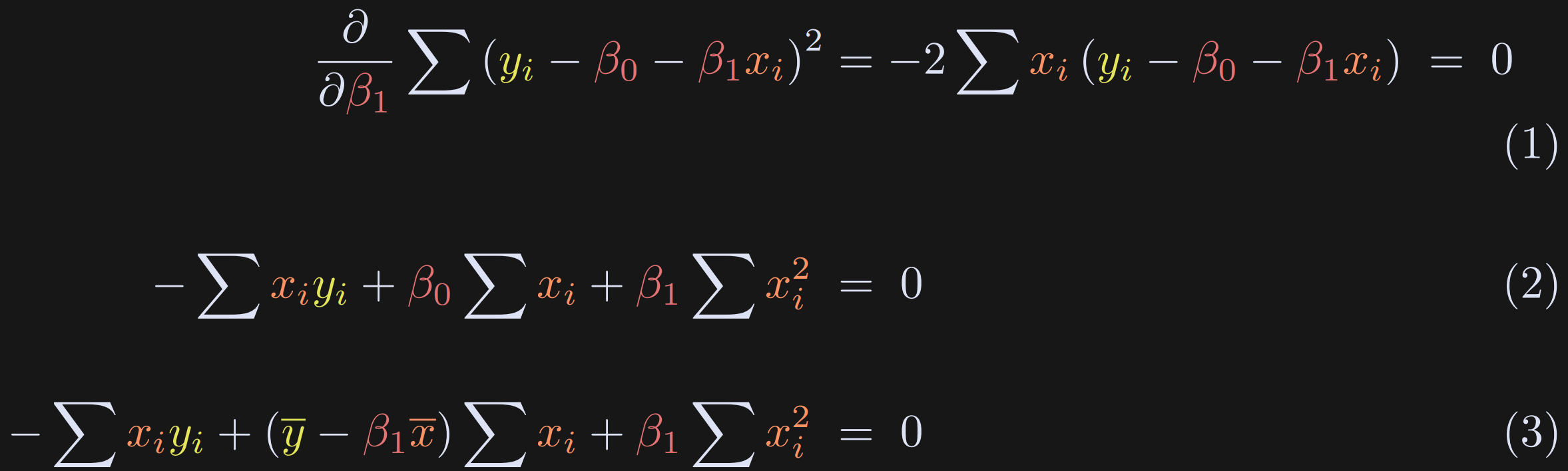
The derivative with respect to β₁ is nearly the same as that for β₀, but there is an additional xᵢ term.
Expand the terms. β₀ appears in the equation, but we’ve already solved for that in the previous equations block.
Here I replace β₀ with its definition from earlier.
The rest of the solution simply involves some algebra to expand, group terms, and isolate β₁ on one side of the equation. Equation 1 below follows from Equation 3 above.
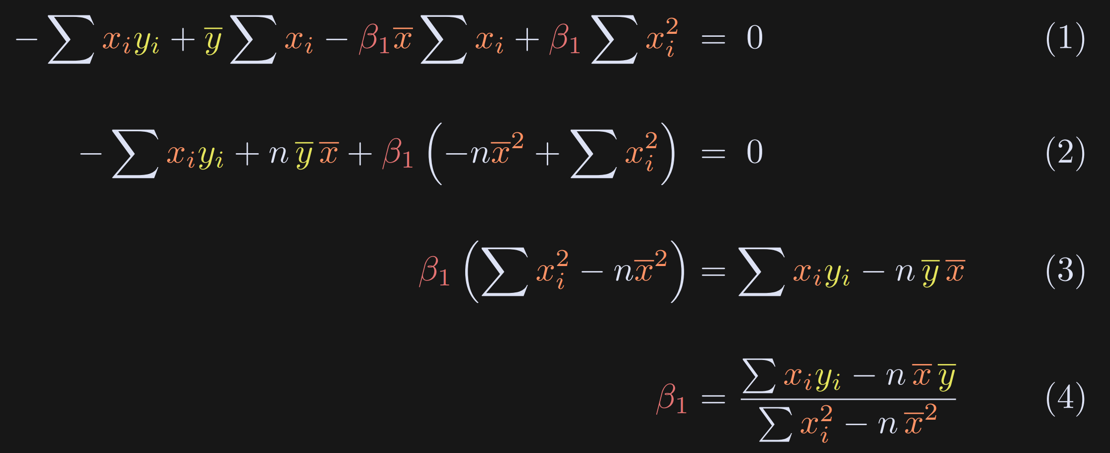
Here I expand the definition of β₀.
Group the β₁ terms. Also note that the sum of the data points equals n times the mean.
Just some algebraic rearranging.
The final result, which is an equation for β₁.
To summarize the post so far: We have equations for the correlation coefficient and for the two parameters (intercept and slope) of the best-fit line through data.
I haven’t yet explained how those analyses are related, but it’s been a lot of math so far, and I want to switch to code to build some intuition (and yes, also to build suspense) before getting back to the relationship between correlation and slope.
If your math engines are still fired up, feel free to scroll down a few sections to the Mathematical analysis section. Otherwise, join me in a code demo so you’re refreshed before seeing more equations.
Code demo 3: Correlation ≠ regression
(You know the drill: My generous benefactors can benefit from the video of me telling jokes and teaching code for this demo.)
The goal of this demo is to show examples of where the regression slope and correlation are similar, distinct, and exactly identical.
I’ll start by showing and interpreting the figure, and then I’ll show and explain the code that generates the figure. Notice that the correlation coefficients are identical in all four subplots, while the regression slopes have three unique values across the four plots. In each plot, the x-axis and y-axis have one tick mark indicating the means of both variables.
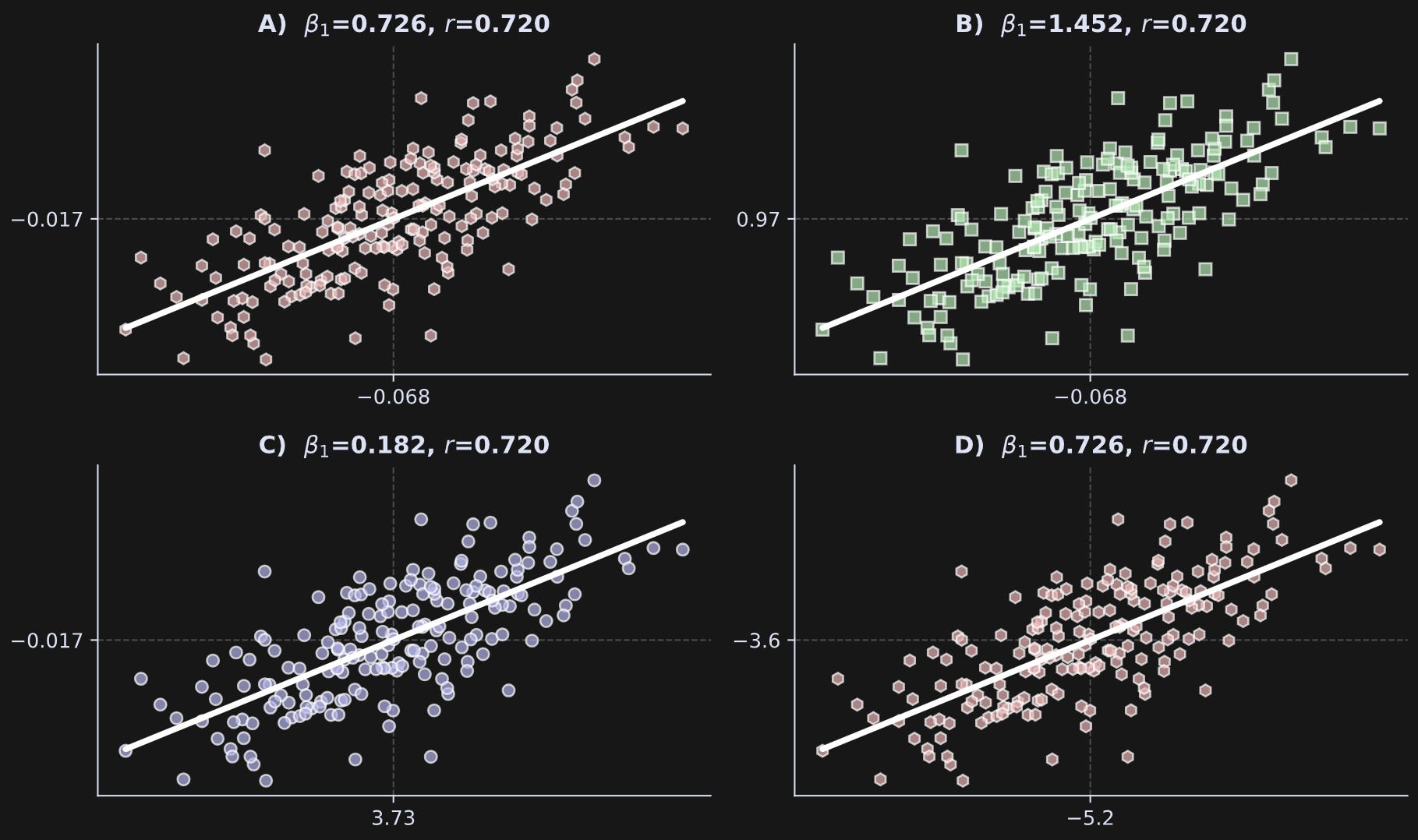
Panel A shows a case where the slope and correlation are close. How close is close? The two values actually can be exactly identical for reasons I will explain in the next section. Before getting there, you can make them identical in the code by uncommenting the lines that z-score the data. Thus, when the data are exactly z-scored and both variables have standard deviations of exactly one, then the correlation coefficient exactly equals the regression slope.
Panel B shows a case where the slope is larger than the correlation coefficient. Notice the variable means relative to those in Panel A.
Panel C shows a case where the slope is lower than the correlation.
Panel D shows a case where the regression slope and correlation are again similar — and identical to those in Panel A — but the means and standard deviations are quite different.
I find this demo quite compelling, and I hope you agree: The regression slope can be smaller than, equal to, or greater than the correlation coefficient in exactly the same data simply by scaling the variables.
If you find that weird or counter-intuitive, then that’s great! It means you can look forward to learning about it below. And if you find that result intuitive but you don’t know why it is the case, then that’s also great, because you can look forward to the rigorous discussion below :)
But before that, I want to explain the code that creates that figure.
Try to understand the code below before reading my numbered explanations below that.
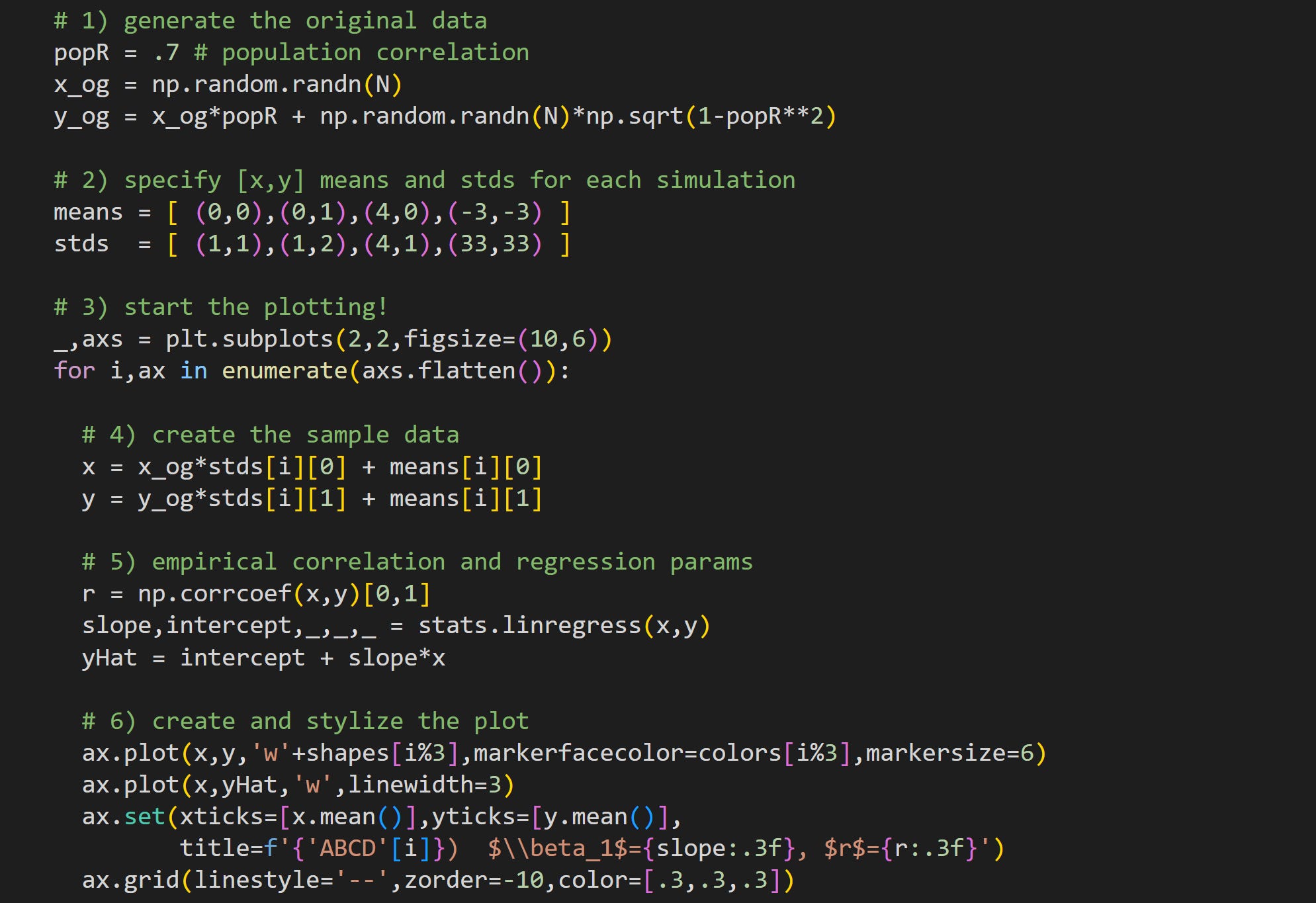
Here I generate some correlated random data. Notice that these data are created before the for-loop. That means that all four panels are created from the same ur-data (variable
x_ogandy_og). The online code file has two additional lines (not shown here) that force the_ogvariables to be exactly standardized (mean of zero and standard deviation of one). If you run that code, the slopes and correlations will be identical in panels A and D.The data in each of the four panels will be shifted and stretched to have a mean and standard deviation specified here. The elements in the tuples are used to change the statistical characteristics of x (first element in each tuple) and y (second element).
Loop over the four axes to create and visualize the data.
Here’s where I create the sample data. Notice that all datasets come from the same ur-data but are stretched by the standard deviation parameter, and shifted by the mean parameter. Because the sample are not perfectly standardized, this stretching and shifting will also be approximate, not exact. I’ll get back to this point in the next code demo.
Here I calculate the correlation coefficient and regression parameters. Then I create the predicted values of y using the estimated regression parameters.
Plot the data! The sample data are shown as a scatter plot while the predicted data are shown as a white line.
Mathematical analysis of best-fit line vs. correlation
As you saw in Figure 3, The relationship between the correlation coefficient and best-fit line from regression depends on the data, in particular, the means and standard deviations of the data.
The equations below start from the solution to β₁, and then replace terms with the s* terms I defined when introducing the math of the correlation coefficient.
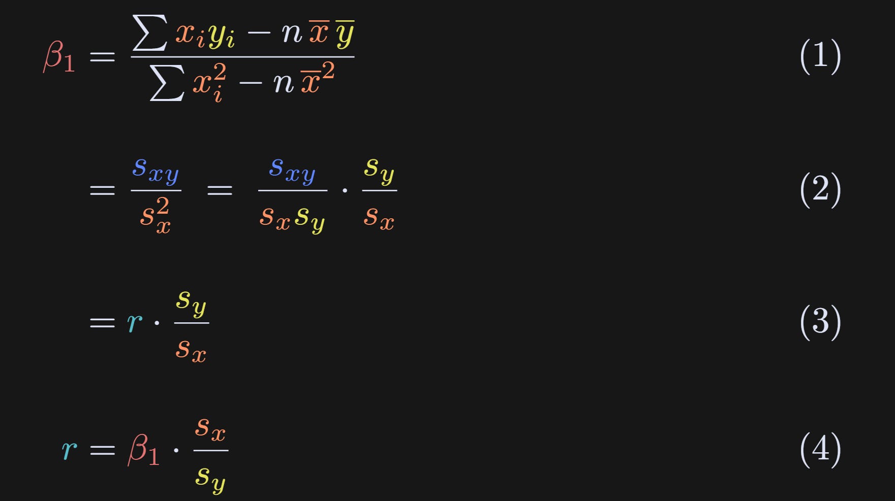
Same definition that we discovered earlier.
I’ve replaced the numerator with s_xy and the denominator with sₓ² as I showed towards the beginning of the post. Then I apply a “trick” where I split sₓ² into sₓ× sₓ and multiplied by sy/sy. Multiplying a fraction by 1=k/k is fairly common in math proofs.
And voila! Algebra has revealed that the slope equals the correlation coefficient scaled by the standard deviations of the two variables.
We can also rewrite r as a function of β₁. Thus, the correlation between two variables is the slope of the regression line between them, normalized by their standard deviations.
And that’s the main theoretical conclusion of this post: The correlation coefficient and the slope of the best-fit line are related to each other, but in a data-dependent way.
From this result, you can also see why the slope and correlation coefficient are equal when both variables have identical standard deviations (sy/sx=1), even if the variables are not standardized (standard deviation of 1). You can also see that that equality holds regardless of mean offsets.
Code demo 4: Numerical simulations of the equations
Many people do not find math equations intuitive. Therefore, the final code demo is to demonstrate that the equalities and relationships that I wrote in the equations, work out in numerical simulations.
Note about equations vs. simulations: “Chalkboard” proofs and code demonstrations are two complementary ways of understanding math: Proofs provide rigorous arguments but often fail to give intuition, whereas examples and visualizations provide intuition but lack rigor. I think the best way to teach math is to leverage both advantages.
The code allows you to specify the correlation strength, sample size, and means and standard deviations of the two variables, translate the math equations into code, and confirm the results against the outputs of numpy and scipy functions that calculate the correlation and regression parameters.
As usual, I encourage you to try to understand the code below before reading my explanations.
Also as usual, my generous supporters have access to a video walk-through and deeper explanation of this code. Scroll to the bottom, my friends!
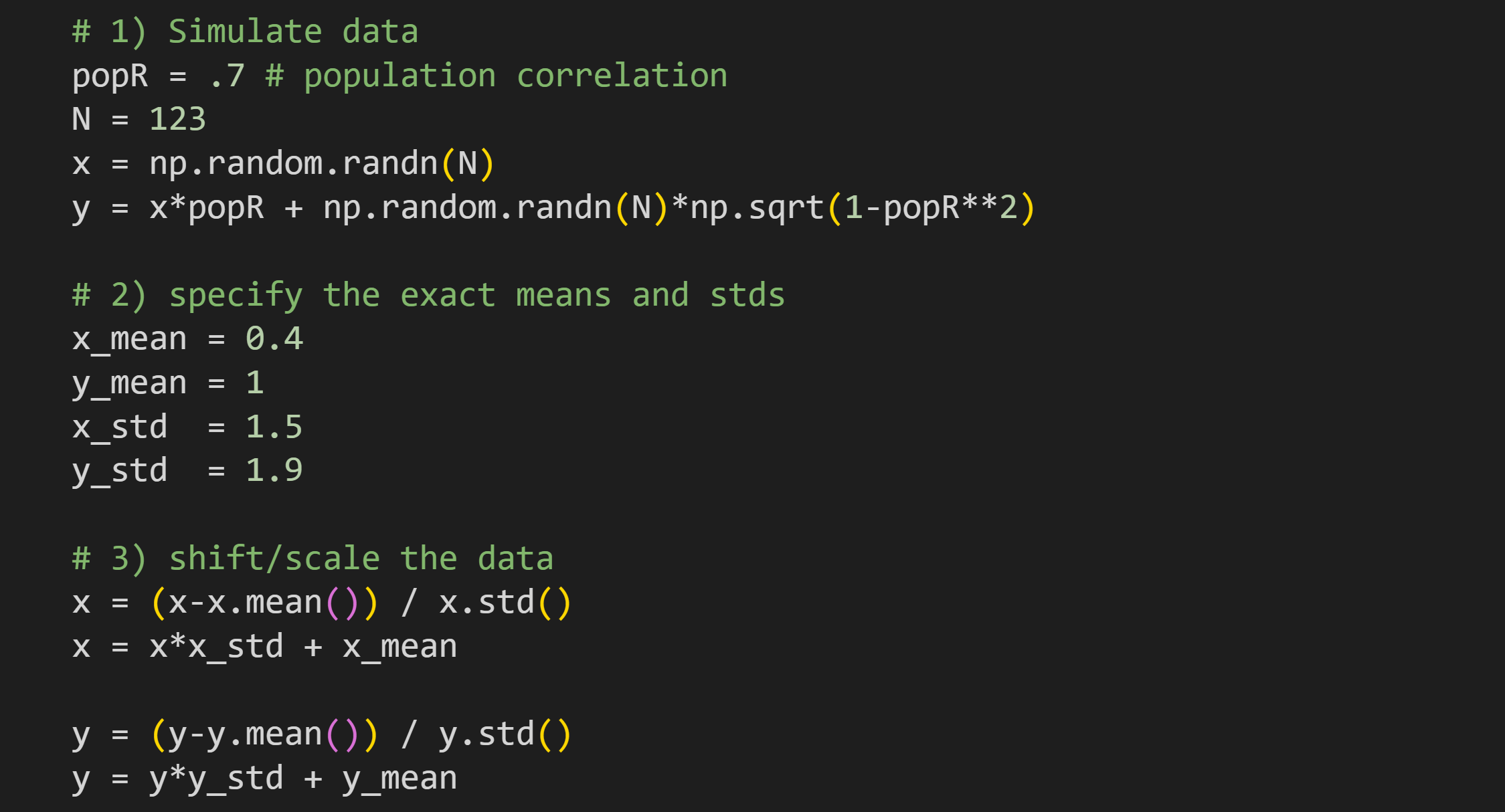
Here you can specify the population correlation and sample size. The two variables are simulated using the same code that you’ve seen several times.
Here you specify the descriptive characteristics for the data. Interesting cases to try include where the means are zero and standard deviations are one; means are non-zero and standard deviations are non-one but equal to each other; anything else; standard deviation of zero (this will produce errors and you have to figure out why!).
In order to imbue the data with the exact characteristics specified in Step 2, it is necessary to standardize the data first. Thus, the first
x=andy=lines mean-center and unit-variance-normalize.After standardizing, the data are scaled and shifted to have the exact mean and standard deviation specified in Step 2.
There is more code in the online code file that prints out the mean and standard deviation of the variables. That confirms that the shifting and stretching is accurate. For example, the text below is the output when using the parameters specified above.
       Mean  |   Std
-------------+---------
x  |  0.400  |  1.500
y  |  1.000  |  1.900
Now we have the data; it’s time for the analysis!
It is convenient to have variables for the means. On the one hand, we already have these variables from the previous code block; this provides additional empirical confirmation and is easier to adapt to new data.
Use numpy to calculate the correlation coefficient. That will confirm the accuracy of the next step.
Calculate the correlation by directly implementing the formula I showed in the beginning of the post.
Obtain the linear regression parameters from scipy. As above, this is used to confirm the accuracy of our code.
Calculate the regression parameters by implementing the equations I showed earlier in the post.
Calculate β₁ from the correlation coefficient scaled by the ratio of the standard deviations.
There’s a bit more code at the bottom of that code block to print out all the results. Here’s an example output:
Correlation (manual): 0.66425
 Correlation (numpy): 0.66425

     beta-1 (manual): 0.84138
      beta-1 (stats): 0.84138
       beta-1 from r: 0.84138

  Intercept (manual): 0.66345
   Intercept (stats): 0.66345
The important thing to look for is that the results are identical for the various calculations of each statistical term.
When to use which analysis?
If you only need to know the normalized strength of the relationship between two variables, then a correlation is easier to interpret: you have one parameter instead of two, and the coefficient is directly interpretable.
If you need to interpret the results in the scale of the data, use a regression. Examples include: predicting an increase in IQ from early-life nutrition; predicting an increase in salary from years of education; predicting a decrease in hospital stay duration from medication dose. The regression is slightly more complicated because it has more parameters, but it allows for a more nuanced interpretation.
If you have more than two variables, it’s often best to use a multiple regression instead of correlations across all pairs of variables.
Thanks for reading!
I hope you found this post elucidating and enjoyable. Perhaps you’re even a tiny bit smarter now than you were before reading it.
I work hard to make educational material like this. How do I have the time to do it? Well, last month some very kind people supported me by enrolling in my online courses, buying my books, or becoming a paid subscriber here on Substack. If you would like to support me so that I can continue making material like this in the future, please consider doing the same 😊
Detailed video walk-throughs of the code
Paid subscribers can access the videos below, in which I provide detailed explanations of the code demos. It’s an additional piece of value I provide to my generous supporters.
Keep reading with a 7-day free trial
Subscribe to Mike X Cohen to keep reading this post and get 7 days of free access to the full post archives.